Our master bedroom refresh
About a year and a half ago, I shared inspiration for our master bedroom refresh. As often seems to happen with these more private spaces (as opposed to the more public spaces that everyone enjoys), our bedroom wasn’t at the top of the priority list (even though it is very much a hub of family life). We have finally completed what we set out to do, though, and I’d love to share the finished space with you today!
To refresh your memory, here’s where we started:
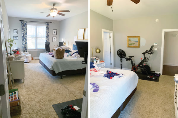
As we discussed, this room does A LOT. It’s where we sleep, obviously, but it’s also where our kids’ clothing is stored, where they get dressed in the morning, and where they pull on their jams at night. It’s our workout area, where our Peloton and weights live. And on top of all that, it’s John’s office 3-4 days a week. While it’s a good-sized room, again, that’s a LOT.
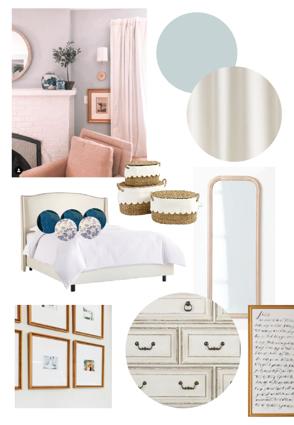
Here was the original refresh plan. My goal was to make the design of the room more cohesive, with a classic and cozy style:
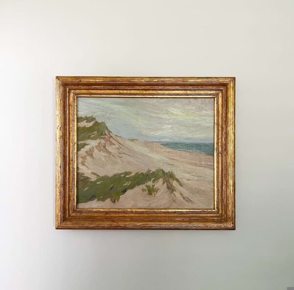
Here’s the landscape painting that inspired the color scheme. This was my gift to John on our wedding day eleven years ago – it reminded me of the dunes near his family’s cottage in Michigan. It has hung in our room ever since.
And here’s the after!
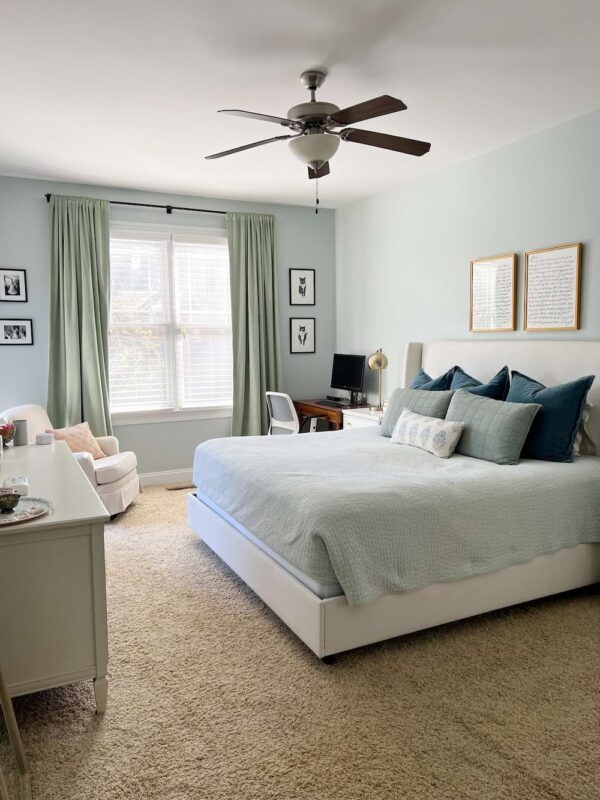
Ahhhhhh. It turned out even better than I had hoped :) Here’s a little breakdown of what we did:
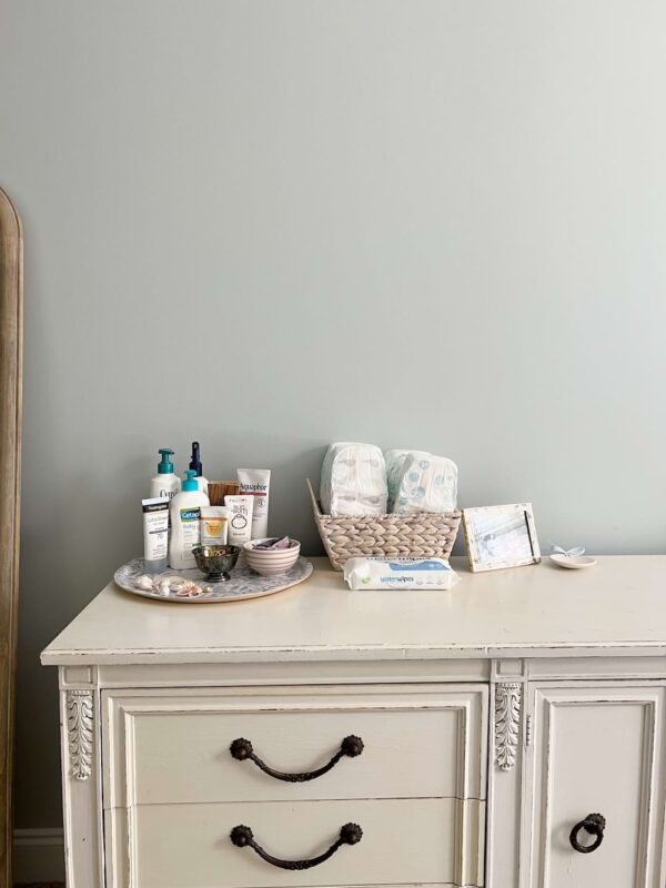
We painted the walls. Thanks to longtime reader Emma, we went with Benjamin Moore Pale Smoke and I think it is the perfect color for this space – calming and elegant. We hired our handyman to paint and it was 100% worth it, as always.
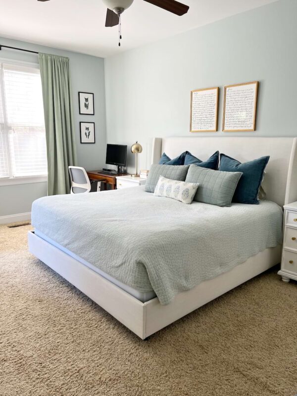
We bought an actual bed (!!!). Those of you who have been here awhile know this deserves all the exclamation points. I think I started talking about wanting a real bed in 2013, ha! After much debate, we went with the Charlotte bed in Zuma White, which now appears to be called the Tilly bed. We have been so happy with it!
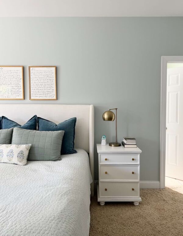
We refreshed our bedding. We kept the same quilt (not replacing that puppy until our kids are out of diapers, ha!), sheets, and big blue pillows, but added the green shams (in sage green) and floral pillow. (For the latter, I went with the 12×24 size and 100% should have gone larger for our king bed. Was trying to save money but wish I hadn’t in this instance :))
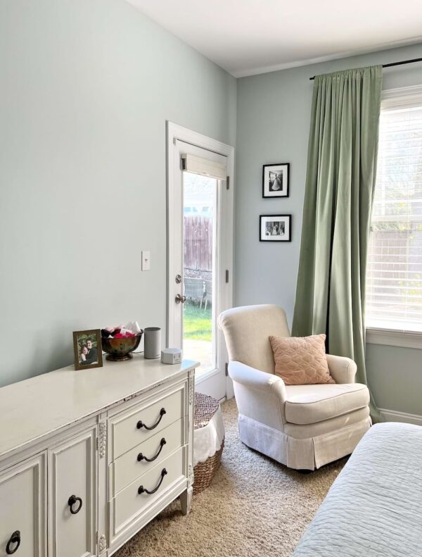
We switched out the curtains and hardware. I splurged on these custom curtains in an extra-long length so we could hang them high and I think they make the room. Sometimes I turn the corner and they practically stop me in my tracks, truly! We got blackout lining (rod pocket style) and the quality is excellent. We paired them with this curtain rod – simple and classic.

I have recently been thinking a lot about what a blessing our mortgage is. We’re just past a decade in this house, and in some ways, it seems so crazy that we’re still paying essentially the same amount each month when rent, home prices, and interest rates have soared all around us. It certainly eases the pain of squeezing a bed, home gym, double closet, and office into one room :) Would this multi-purpose room be our choice if money were no object? No. But it is certainly the right fit for right now, and for that we’re grateful.
Here’s the full source round-up:
Paint color: Benjamin Moore Pale Smoke
Bed: Tilly/Charlotte Bed in Zuma White
Quilt: Garnet Hill (old)
Blue and white floral sheets: Target
Blue velvet Euro shams: Pottery Barn (old)
Soft green shams: Casa Luna at Target (sage green)
Floral pillow: Linen + Cloth (12×24″)
Boxspring cover: Amazon
White dresser: Vintage
Curtains: Etsy
Curtain rod: Pottery Barn
Floor mirror: Target
Framed wedding vows over bed: Calligraphy by Simply Jessica Marie, framed by Framebridge
Bedside tables: Richards 3-Drawer Nightstand from Birch Lane
Gold lamps: Target (old)
Desk: Mid-Century Mini Desk in Acorn from West Elm (bought on March 11, 2020 when we realized John would need a desk at home for the foreseeable future, yipes!)
Desk chair: Daily Chair from Branch Furniture (white frame, slate cushion)
Scalloped rattan basket: Ballard Designs
Blue and white floral tray: Rifle Paper Co.
It’s not too often you invite a bunch of friends over for a tour of your bedroom, but here we are! I hope you enjoyed it, and perhaps leave encouraged that it’s taken us over a decade in this house to get to this point :) Of course, as always, please let me know if you have any questions – I’m happy to help!
Affiliate links are used in this post!












Looks amazing!!! I love seeing all of your home projects.
We had a similar cream color upholstered headboard several years back so just a note of caution, ours got very dirty after a few years! This could definitely be because we allowed our dogs to sleep on our bed, but I really think it was maybe from our heads lol because right around the pillow line it got discolored. For our next bed, we went with wood.
Love how your bedroom turned out! Funnily enough, I just realized that my master bedroom has a lot of similar elements — similar paint color, blue quilt, curtains, nightstands, lamps, etc. We’re using a hodgepodge of old dressers at the moment, but I’d love to find something like what you have and finish it off. Maybe this will be the inspiration I need to get moving on it :)
It turned out beautiful! And I love how your bedroom serves several purposes. I feel like a lot of house tours online are so far from what our everyday life and own homes look like (butler’s pantry, home gyms, etc.), that this is much more inspiring to me! Thank you for sharing!
Cannot agree more about a 10 year old mortgage and the blessing that is to our family now! Also, hahahaha….we felt the same way about our bedroom mattress that you do about your quilt!
This looks so good!