31 January 2011
(Click to enlarge!)
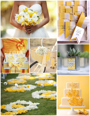
How about a gorgeous, sunny yellow board after the gorgeously sunny weekend we just had? It was 69 degrees here yesterday! I love how this board is filled with graphic touches (the teardrop cake, the striped bows, the chevron-printed centerpiece boxes) but still seems sweet. And isn’t that bouquet BEAUTIFUL?
The Details
First row, left to right: bouquet by Blue Lotus, photographed by Poser, via Southern Weddings; programs by Bird and Banner from Martha Stewart Weddings
Second row: favor boxes, bike photo by Allyson Magda (designed by Jill LaFleur) via Style Me Pretty, centerpiece photo by Erin Hearts Court (designed by La Partie Events) via Style Me Pretty
Third row: ceremony photo by Erin Hearts Court via Style Me Pretty, cake from Martha Stewart Weddings
27 January 2011
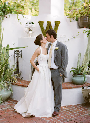

Just two lovely, casual bride and groom portraits for you on this fine Thursday! The top one is by Michael and Anna Costa, and the bottom is by Aaron Delesie. Love how it looks like they just happened to pause for a moment and steal a kiss. And the pockets are perfect :)
26 January 2011
Have you all seen Joanna’s apartment tour?
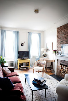

Gorgeous! I love so much about it, from the natural brick and wood-stacked fireplace to the built-in bookshelves and abundance of framed images. But what I love most is the gorgeous muted gray blues that pop up throughout the space. Not surprising, then, that Joanna is providing the main inspiration for painting my new office chair. We started out with pretty much the same thing:
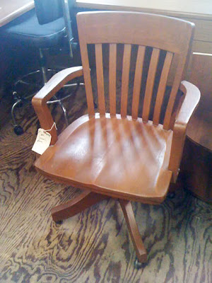
Jenny from Little Green Notebook, the design genius behind this space, spray painted the chair with what she thinks was Krylon’s “Medium Gray.” This was the result:

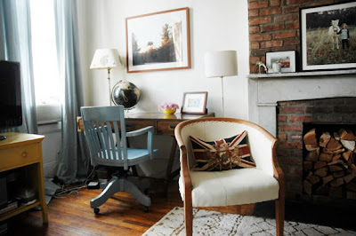
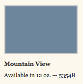
Gorgeous! Unfortunately, Krylon doesn’t list a “Medium Gray” color on their website, and the chair at least appears to be more blue than gray (to me, anyway!). The closest option seems to be “Mountain View:”
There’s also “Stonewashed Denim”

…and “Classic Gray.”

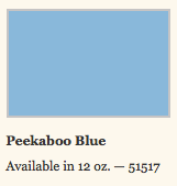
Do those look too dark to you, though? The only other possibility is “Peekaboo Blue,” but that seems too bright:
Which brings me to my two questions for you today:
1) Should I paint the chair or leave it as is?
2) If I should paint it, which color would you recommend? One of these blue grays, a different blue gray, or something more neutral, like white? Seleta suggested a few gray blues in this post, which I’m also pondering…
Let me know what you think!
All apartment photos by Karen Mordechai. Want more details? Check out Joanna’s blog post here and Jenny’s blog posts here and here on the redesign. Both give tons of tips and inside sources for the details seen in the photos!
25 January 2011
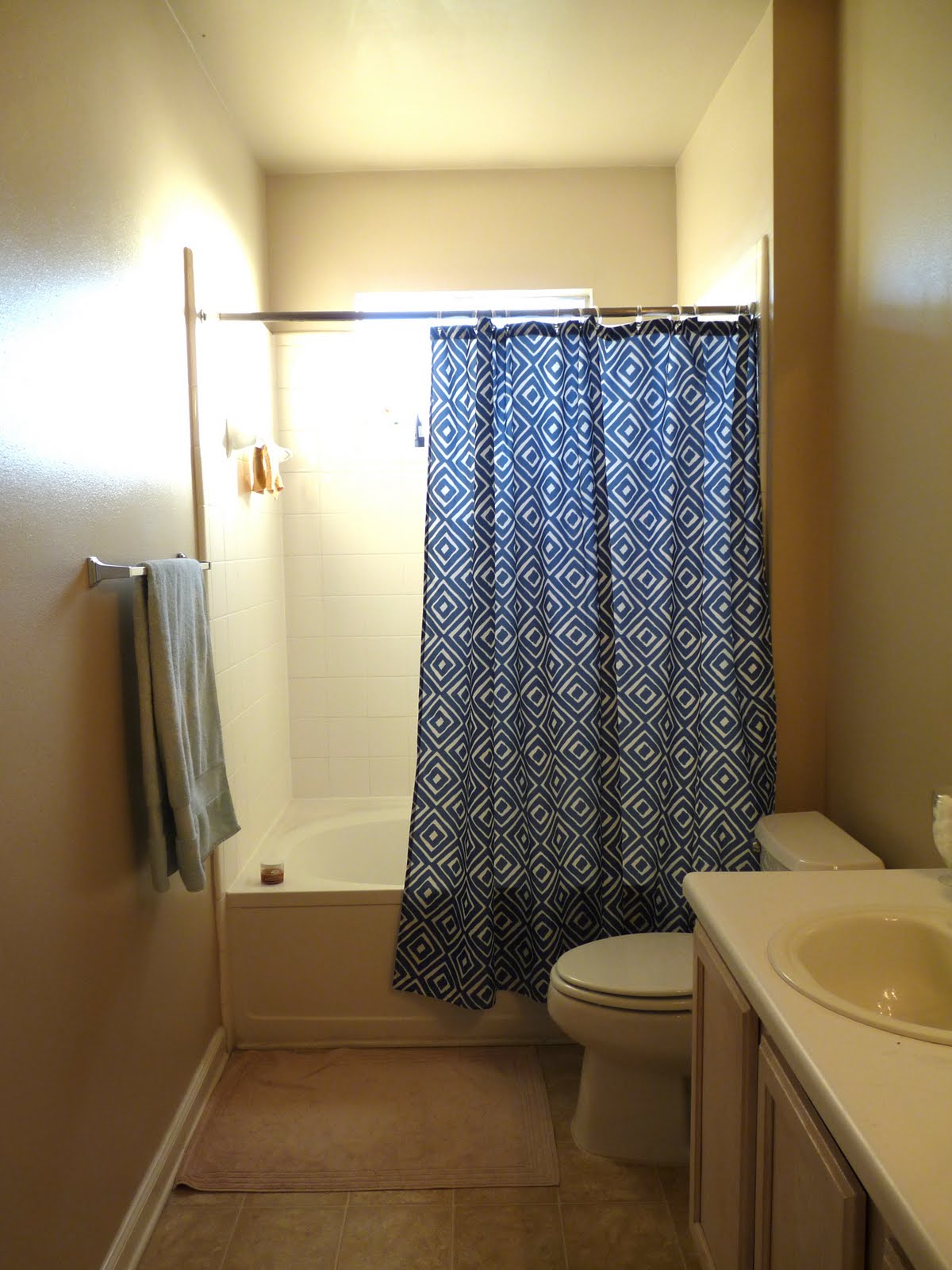
Continuing with my now two-post-long update streak, we turn today to shower curtains. A few months ago I posted a few options I was considering, then promptly put “buy shower curtain” on the back burner as other priorities pushed to the front. All of that changed, however, on a trip to Target last week. I was trailing along behind my Dad and J, who were on the hunt for a bathroom scale, of all things, when I rounded a corner and came face to face with the perfect print. It has all the qualities I loved in the Viva Terra number without the steep price tag — this one was just $15! Here it is in action:


I’m pretty sure it’s a brand-new spring line product that doesn’t seem to be available on Target’s website (though while searching for it, I came across this one and this one that I also liked!), so you’ll have to head to your local store if you, too, would like to pick one up.
P.S. Just so you know, I wasn’t planning to show you the curtain in my bathroom until I made a few more updates, but my plans were foiled by the lack of an existing internet photo. Couldn’t wait to share, so I hope you like!