29 October 2013
My sister is having a baby! Have we discussed that she and my brother-in-law are not finding out whether it’s a boy or girl? (I actually think the pendulum is swinging back this way — I’ve noticed more and more people going this route.) She came to me back in August with a request for some help on the nursery, and I was more than happy to oblige! I love having loved ones in different stages of life — there’s always something new and fun to create around :)
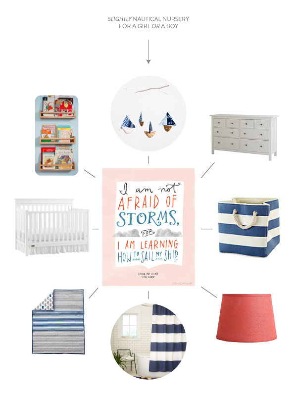
When Kate requested my help, she already had a crib, a dresser, and bedding picked out. The bedding is gray and blue, and she was looking for an accent color that would help the overall design feel less boy-y. She tossed out yellow, orange, or aqua. I countered with coral, since orange isn’t that girly, I wasn’t feeling yellow, and I thought their Minnesota locale needed something warmer than aqua. I also suggested that if they end up having a girl, they can layer in some light pink for a slightly girlier feel. We agreed, and purchased this print as the basis for the color palette.
She was also considering a striped wall, but we agreed that gray walls and striped curtains would be a better option. We chose Harbor Gray by Ben Moore when we were together for the baby shower, and it looks SO good! It’s a beautiful light gray that doesn’t read too blue, gray, or brown. Highly recommended.
Here’s what we ended up with!

A lot of these pieces K + C already have, but this boat mobile isn’t one of them. However, I think they should buy it :) So sweet! Their dresser is from Ikea and their crib from Target. Aside from the bedding, we pulled in stripes in the curtains (yes, that’s a shower curtain, but it’s fabric and we’re going to use it on the window!). I’m also recommending they pick up some of these or these striped storage cubes — they’ll be perfect for sorting toys later on. This shade is a great hit of coral. Finally, Kate picked up some Ikea spice racks and painted them coral for book storage!
Does anyone else have trouble making a multi-color palette look cohesive? It can be tricky to find pieces that incorporate different combinations of your chosen colors, and to make sure that just the right amount of each color is represented. I know it’s something Kate has trouble with, so we brainstormed different pieces that could potentially tie together the gray, coral, pink/peach, and blue as she finishes the room. The short list? A rug; fabric for a pillow or curtains; vintage books for a book shelf; simple toys; a blanket for the glider; artwork (like our print!); stuffed animals (love this one for K+C); vintage metal letters; a felt, fabric, or crepe paper garland (one example); a fun light fixture; or a little painted table and chairs… just to name a few. Finding the pieces with the perfect palette can take a while, so if you’re in the same situation, just keep your eyes peeled and be ready to pounce!
What do you think: would this design work for a girl or a boy? And just for fun, what do you think my sister is having? Family consensus is it’s a boy, but my vote is girl! :)
25 October 2013

Happy Friday, friends! I thought I’d send you into the weekend with a collection of some of my favorite fall music. Warm and cozy, with lots of bluegrass and strings, it’s perfect for pumpkin carving parties and soup nights. Click here to listen. (You will need a Spotify account, I think.) I hope you enjoy!
23 October 2013
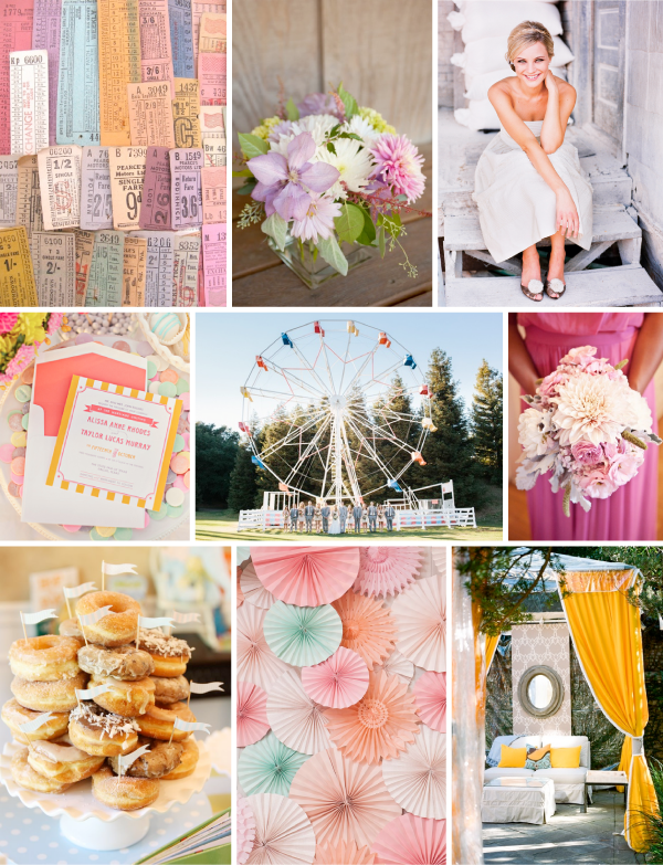
John and I made ham biscuits at our state fair last weekend (yay for October goals!), and though we didn’t have much chance to walk around, even our brief visit made me so excited for corn on a stick, ferris wheels, and cute farm animals. That, and the image of tickets in the top left corner, inspired this inspiration for a colorful wedding!

Tickets from ThriftyPyg, clematis centerpiece photo by Joann Arruda, short dress gal photo by Joey & Jessica via Southern Weddings, pink bouquet photo by Caroline Joy via Style Me Pretty, tented reception space photo by A Bryan Photo via Southern Weddings, paper pinwheels via The Sweetest Occasion, donuts via Pizzazzerie, invitation by Southern Fried Paper via Southern Weddings, ferris wheel photo by Marianne Wilson via Ruffled
I love how the tented reception space is vaguely reminiscent of a big top. And of course I love the donuts :)
21 October 2013
Hello, friends! Today I thought I’d share our gallery wall! I wrote about this project a bit here — thank you again for your comments!
Unlike the dining room table refinishing project, I felt good about just diving into this one! Based on my inspiration, I tried to stick to the pink, blue, and metallic families; made sure I had a mix of photographs, watercolors, oils, and more typographic designs; and incorporated a variety of frame and mat styles.
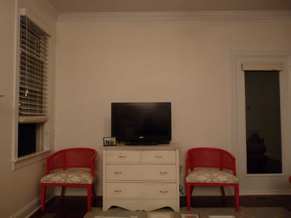
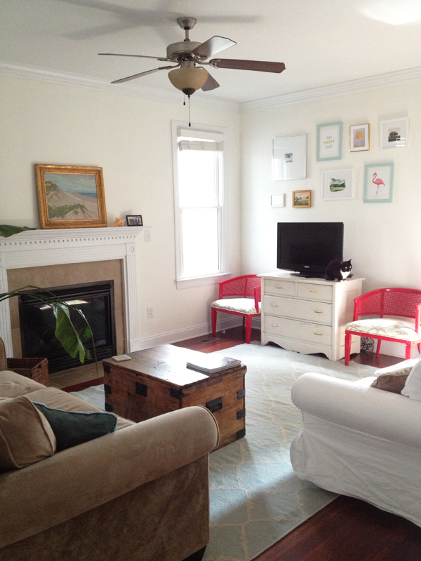
Here’s the before:

Yikes! I knew I wanted an arrangement that softly arched over the TV, so we started by playing around with all the pieces on the floor, right in front of the dresser. By doing it in front of the wall where it would hang, it was easy to approximate the space between each frame. Then, we just started at one end, and added pieces left to right, eyeballing as we went! Definitely a two-person job, so thanks to John for all of his help :) I’m not sure if this technique would work for everyone (I like to think one of my super powers is the ability to accurately eyeball whether something is even or level), but it worked great for us.*
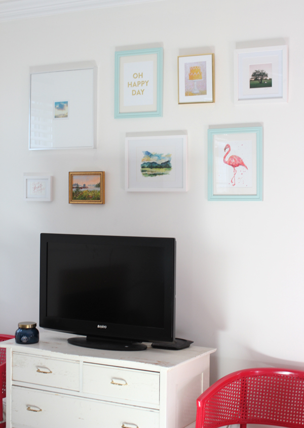
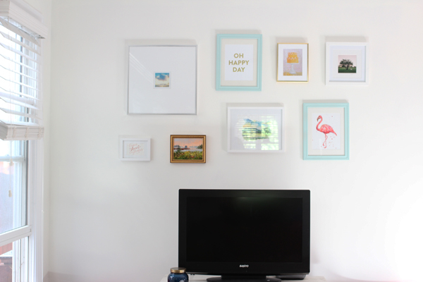
Here’s what the space looks like now!


I would love to tell you a bit more about each piece, because they were selected with love! Apologies in advance for the photos — this project was so hard to photograph, with the glare on the glass and the shadows from the frames!

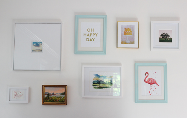
From left to right:
The “peace, love, and cupcakes” print is actually a card a friend sent to us (similar version here). The large square is an instagram sunrise from a trip to Florida. The little oil painting is a commissioned piece that was made for my grandmother many years ago. It’s of the view from her front porch in Maine. The Oh Happy Day print is available in the SW Shop! The watercolor of the Blue Mountains was a gift from my sister-in-law. The cake print is by Paul Ferney. The flamingo print was a wedding gift from two dear friends (available here). Last but not least, the photo was a gift from our wedding photographer, taken during our cocktail hour picnic.
Let’s talk about the frames for a minute. I was worried that they would add up quickly, but ended up being pleasantly surprised! Thankfully, several of them had already been collected prior to this project, so I only bought three new. Even so, the total cost was low: three were from Target, one from Michael’s, two from A.C. Moore (spray painted blue), and one from Goodwill.
To conclude, this project gets two thumbs up from me: it was fairly easy, fairly inexpensive, and added a welcome dose of color to our white walls. Can’t wait to hang the rest of the art in this room!
*If you’re looking for more exact instruction for hanging, Real Simple has some great advice on measurements and guidelines!

