18 December 2012
Thank you again for all of your help choosing our Christmas cards! As usual, y’all were divided on which design was best, but option no. 1 came out on top in the voting.
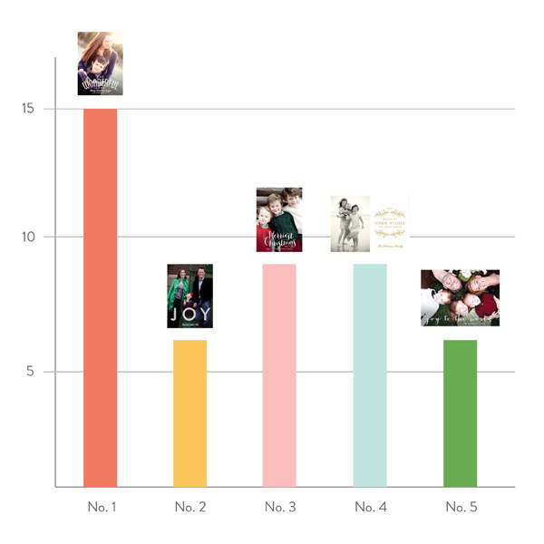
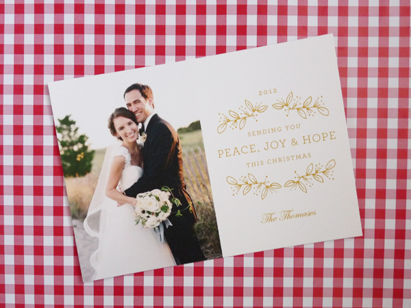
As much as I loved the sentiment of option one, I thought the type treatment competed with the image we had chosen. (The detail of the bouquet made the text a bit hard to read.) Same problem with number three. We decided to table those for another year, and instead went with a design with no danger of that problem!
Of course, I think any Minted design would have looked beautiful with Tanja’s gorgeous images! We feel so lucky to have worked with her.
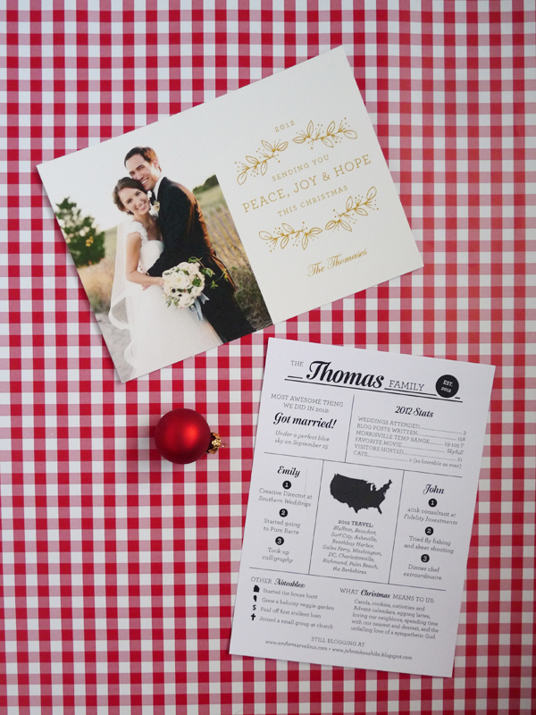
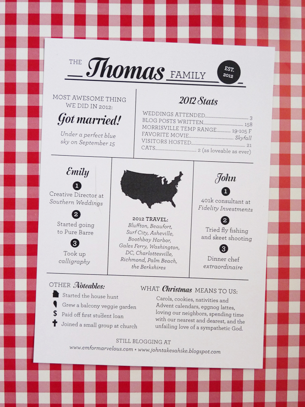
And here’s our inaugural newsletter! I laid it out in Illustrator, had it printed at Fedex Kinko’s, and owe much inspiration to Amanda Jane Jones.
Finally, I addressed each envelope to our nearest and dearest…
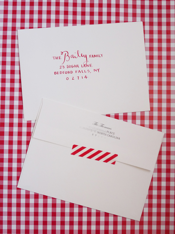
…including one for y’all!
Have you sent out cards yet?
7 November 2012
In addition to our photo Christmas cards, I think we’ll be sending a newsletter! Did your families send holiday newsletters when you were younger? Do they still send one? My family always did, and I loved it! In fact, once I was in about sixth grade, I was often recruited to write it — my Dad and I alternated years :) Even in the age of Facebook, I still LOVE reading all the letters we get from other families, families I’ve known my whole life, when I go home for Christmas. My Dad is in the military, so my parents have lots of far-flung friends that I remember from my childhood but haven’t seen in years. My sisters and parents and I have been known to sit at the kitchen table and pass the letters around the circle, discussing the neatly-encapsulated contents as we read!
Our newsletters were always fairly simple affairs, graphically speaking — printed on plain paper, or maybe holiday letterhead, if my Mom was feeling fancy. I’m hoping to step up the game a bit for my and John’s debut, and am taking inspiration from these beauties I found around the internet:

By Amanda Jane Jones. Go here to see more angles!

Also by Amanda. More here!

By Aprile Elcich.
I’ll update you once ours is complete!
8 August 2012
Yesterday I showed you the process of designing our invitations with Jess at Magpie Paper Works, and today, I’ll share the final product!
Like I said, there were a few aspects of our invitation design that made it difficult to print to a high standard:
1) The PMS color we chose is prone to scuffing
2) The tri-fold exaggerated the scuffing
3) The protective varnishes that help prevent scuffing give the surface a dull sheen, which is something I was very much against
4) I was also very much against cracking along the scores
5) The PMS color and protective varnish both take a very long time to dry
Jess was so persistent in finding the perfect printer to complete this job, and though the process took longer than we both would have liked (with her sending the design out to multiple houses for a sample print), I would say it absolutely paid off in the end. No scuffing, no cracking, no sheen – I couldn’t be happier! Evolution Press in Seattle was the magical printer that made all the goodness happen.
Ready to see? Okay! Here’s what guests saw when they pulled the invite out of its envelope:

I love that sweet little heart! Jess drew the boxwood vine pattern — isn’t she amazing?
Let’s open the first flap, shall we?

Love the unexpected verse! Full of surprises, aren’t we? :)

Once both flaps are open, here’s the full invitation, measuring a larger than life 9×18 inches!

I love it!! Now is the perfect time to give some major kudos to our calligrapher, MM Ink. I think Moya’s work is just incredibly beautiful — classic, while still having personality — and I absolutely love her penning of our names.

Here’s it all together. We chose light pink envelopes for the invites, and dove gray envelopes for the reply cards, both from Paper Presentation (my favorite!). Thought it can’t compare to Moya’s gorgeous calligraphy, I was pretty pleased with how my lettering turned out for our guest addresses.

What do you all think? I hope you love them as much as we do!!
7 August 2012
Hello, friends! As you know, our wedding invitations have flown the coop, so now it’s time to share! I thought it might be fun to walk you through the process today, and then show you the finished product tomorrow.
Like getting married in Connecticut in September, a love for a particular wedding invitation I saw three (yes, three!) years ago was one of the only things I took into planning this wedding. Here it is:

This beauty is a collaboration between I Am Always Hungry, Birdie Birdie, and Battery. My favorite parts? The light type on a dark background, the beautiful mix of fonts and neat typography, the size, the fact that it folded, the clever wording, and the overall classic aesthetic.
So I tucked that inspiration away for a few years, and when it came time to design our invitations, I pulled it back out. I had been warned by a few graphic designer friends that there were certain aspects to this design that made it a very difficult print job, so I knew that this was not a project I was going to be able to tackle alone. The first and only graphic designer I thought about working with was Jess from Magpie Paper Works. I had had the pleasure of working with her on a work project, and loved her clever but classic aesthetic (sound familiar?) and her cheerful attitude.
Having now gone through the whole process with Jess, there are so many things I appreciate about her, and I’d like to list a few here:
1) She was eternally cheerful, and unfailingly as excited about our invitation as I was
2) She was sensitive to our budget, and delivered within our (admittedly smaller than ideal) parameters without ever making me feel like it was a burden
3) She is clearly passionate about her craft, and I loved her clear and concise explanations of the different steps in the process. There were no smoke and mirrors – everything was totally above board.
4) Best of all, and most importantly, she took my inspiration and delivered a final product I love even more. Genius!
After we decided to work with Jess, the ball started rolling quickly. I can’t remember what order, exactly, these steps happened in, but in quick succession, we:
— submitted a deposit (50% of the estimated total cost)
— sent Jess a folder of inspiration
— filled out Magpie’s “client welcome form”
This form asked for the usual suspects, including our basic contact information and basic info about our wedding events (ceremony start time, etc.). We also answered a few questions about our style, and rated ourselves on a scale of 1 to 10 for a few questions: how traditional are you, with 10 being “most traditional” (6), how rustic is your event, with 10 being “formal” (8), how whimsical is your event, with 10 being “serious/reserved” (4), how colorful is your event, with 10 being “lots of bold colors” (6). It was fun to think things through like that!
Here are a few of the inspiration images I sent:

Top to bottom: window decal via Design*Sponge; “yum” bags from Martha Stewart Weddings; white on black envelope by Mr. Boddington’s Studio; black on white invite by Perky Bros, “fancy but not schmancy” by Bird & Banner; wooden invitation photo by Jose Villa; rice packets from Martha Stewart Weddings; gold and navy invite by Plurabelle Calligraphy; black and white programs by Mr. Boddington’s Studio; marriage certificate by Orleans Paperie; calligraphy favor box by Martha Stewart Weddings; coaster and napkin calligraphy by MM Ink, design by Magpie Paper Works, via Southern Weddings (photo by Katie Stoops)
And, of course, the IAAH design above – Jess knew all about that one. Again, lots of typography, beautiful calligraphy, cheeky wording, wreaths, fairly clean and classic design.
Taking all of the above into consideration, Jess sent us this board as a first stab.

Whee! Already so exciting! We sent back our thoughts, and here was round two:

In round three we saw full invitation designs for the first time. Here are three of the six Jess sent over:

Jess took our feedback and presented round four, which included four options. Once we chose our favorite from round four, rounds 5, 6, 7, and 8 were just a series of small tweaks – the basic structure remained the same. Round seven also introduced the RSVP card, which was easy once the invitation was well on its way!
Whew! I think that’s quite enough for one day! Back tomorrow with the finished product, and more details about the ordering process!