A New England nursery for baby boy
Some of you may recall that June’s nursery was not finished until several months after she was born – ha! Knowing that my life will only get more complicated after baby brother arrives and not less, I’m trying to be a little more on the ball this time around :)
My job is made easier by the fact that the space we have to work with needs to stay simple by necessity. It will be his room, yes, but it’s also going to have our second guest bed in it at least for now, so the “baby” elements will be fairly minimal – basically, a crib. Our glider and changing pad are downstairs in our master bedroom, we keep almost all toys downstairs or in our loft, and you all know how we do kiddo clothing around here!
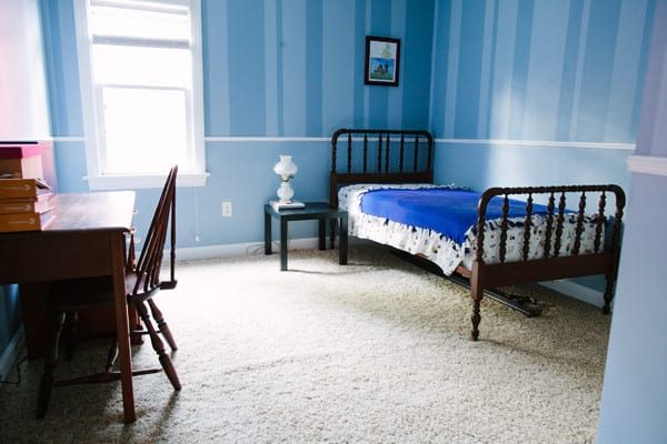
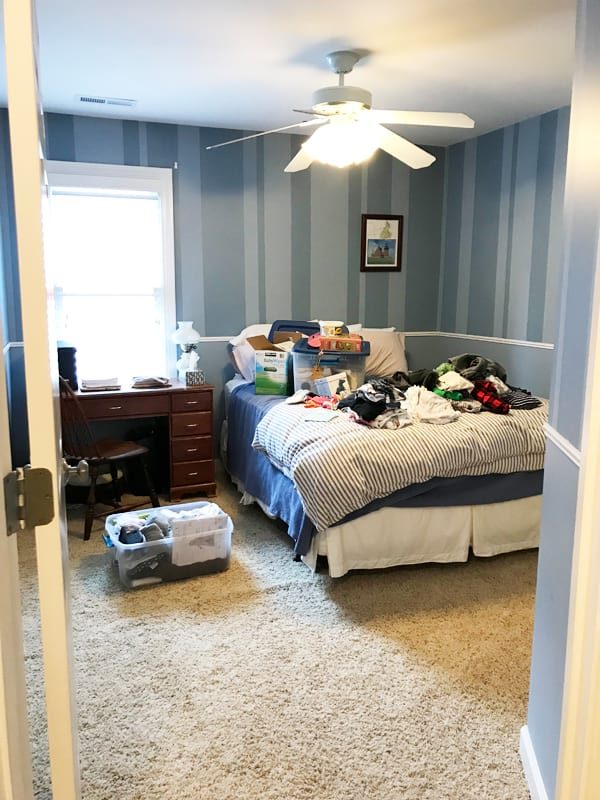
Still, we basically haven’t touched this room since we moved in (it still has the paint job from the previous owners!), and I’m looking forward to making it a lovely, cohesive space for him AND for guests after five years of living here! The above before photos show what it’s looked like over the years since we moved in – the bottom photo is most recent, taken just before we swapped the queen bed for the full and moved the desk into the loft.
My inspiration for the color palette and style is entirely inspired by the Robert McCloskey book Time of Wonder. I’m not sure how well-known McCloskey is outside of New England — some of his more famous titles include Make Way for Ducklings and Blueberries for Sal — but he is an icon where I’m from, and “Time of Wonder” has always been one of my favorite children’s books. The writing is quite poetic, and the illustrations are gorgeous.
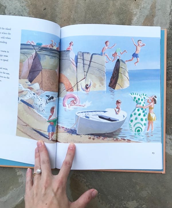
To set the tone, we’re framing three spreads from the book, then building out the color palette from there. (I bought a new copy and cut the pages out verrrrrrry carefully.) Since the pages are a custom job, we opted to go with Framebridge for a reasonably-priced option. They’re still an investment, but I imagine us having these in our home for years, hopefully, maybe even in a kiddo bathroom if brother grows out of wanting them in his own room eventualy. We went with their classic gold Richmond frame, and I’m picturing hanging them on the wall above the crib in a row.
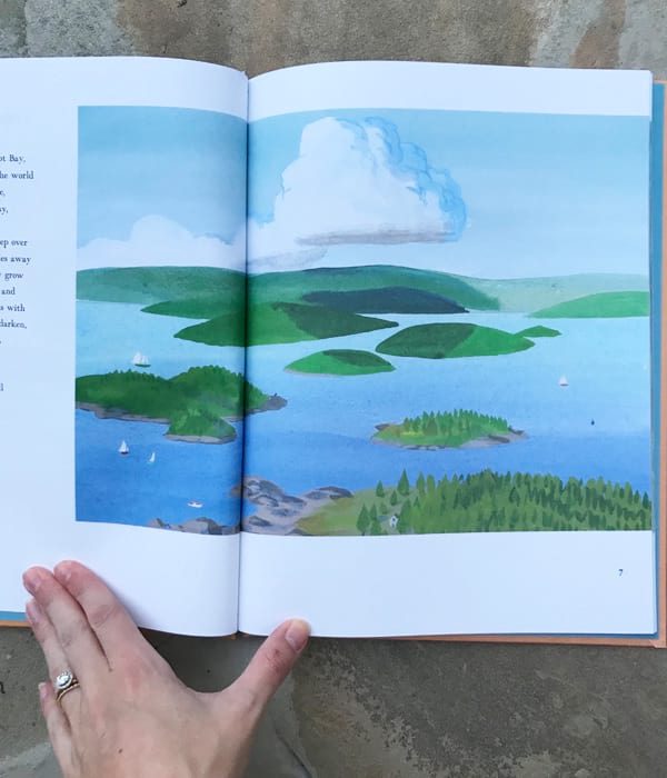
The room had a chair rail when we moved in, and we plan to keep it, painting the top portion a very pale blue and the bottom a kelly green (!), both drawn from McCloskey’s illustrations. I am hopeful about this, but also concerned it might be too much in such a small room?? Fingers crossed it’s not :) Here are a few inspiration images that are setting me at ease:
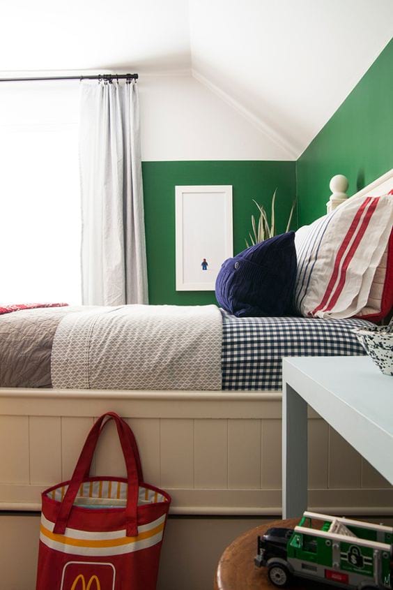
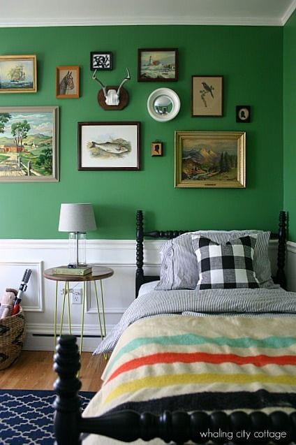
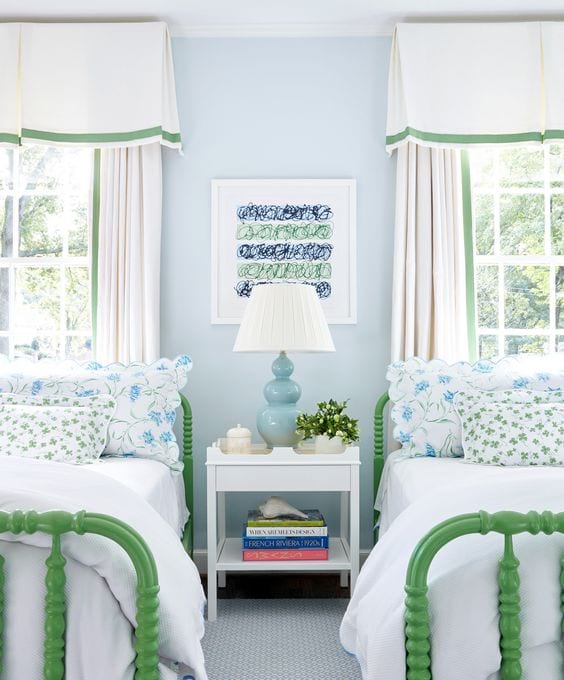
From The Makerista, Whaling City Cottage, and Sarah Bartholomew
The crib is a big question mark. We have no desire to move June out of her crib and potentially disrupt her sleep at the same time as we’ll be waking up overnight with a newborn, but I obviously don’t want to spend a ton of money on a second crib. (The good part is that June’s crib was $0 – a hand-me-down from my parents!) I’m thinking we’ll do the white Jenny Lind crib and call it a day.
That leaves soft furnishings. The spread and sheets on the full bed are white, so I’d love to add a bit of coordinating color and pattern with pillowcases, shams, and a blanket, as well as in the sheet on the crib and maybe a crib skirt? Since the bed is against the one window, I think we’ll go with a simple valance for it, hopefully in a fun pattern. We’re also planning to switch out the fan for a New England-y light fixture, since I think the fan hangs way too low for the room.
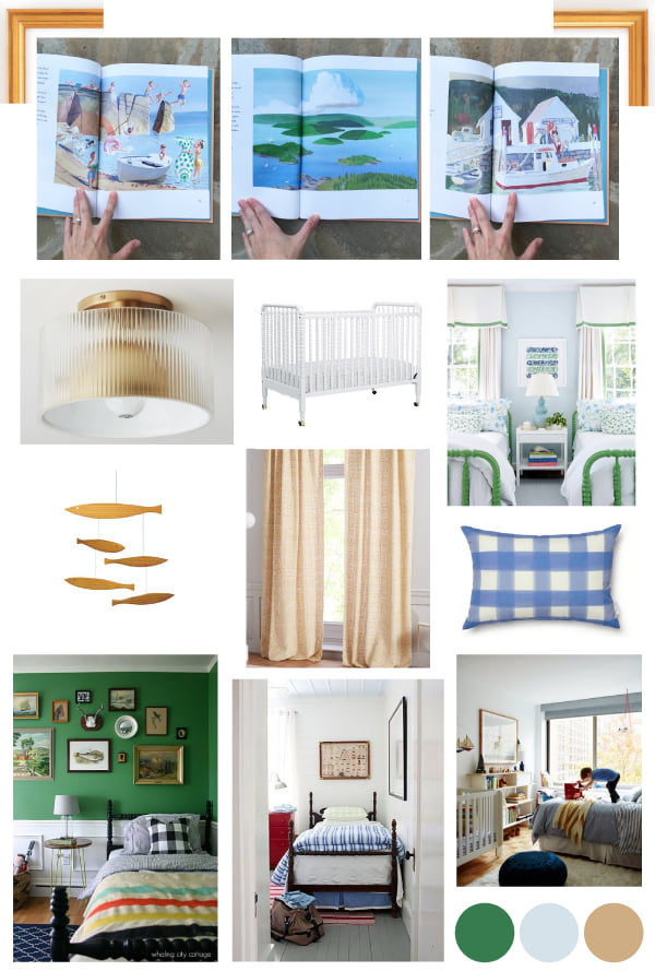
Pillow from Caitlin Wilson, curtains from West Elm, light fixture from CB2, mobile from Aha
Wish us luck that we can knock all of this out by the end of July :)
Affiliate links are used in this post!








LOVE this inspiration, Em–it couldn’t be more perfect for the Thomas family! Framing book pages is such a good idea. I grew up with framed pages from Beatrix Potter books in my room and I’m pretty sure my parents still have them, so rest assured you can hang on to them for a long, long time :) I’ll also give a big thumbs up to that Jenny Lind crib. It’s the same one we have and I’ve been so happy with it!
I love hearing that, both about the book pages and the crib!!
I LOVE Time of Wonder – I was just thinking about it on Father’s Day because it was one of my dad’s favorite books to read with us. I should have anticipated it would be one of your favorites too :-) Please keep us posted on the “after” picture!
Have you and your family read The Little House by Virginia Lee Burton? I feel like that’s another similar book you might like.
You know I will! And yes, we do have that book – such a classic!
Love this inspiration and the colors – what a precious theme for your little man x
Love this SO much. Like Lisa said, it looks perfect for your family! My biggest shock in this post is that you’ve lived in this house for FIVE years!! So crazy!
I am loving the last inspiration photo! I think you should paint the Jenny Lind crib kelly green and paint the walls a pale blue. :)
Oooh that is such an intriguing idea!!
Love this theme! It’s so fun, adventurous, yet still classic like you guys :)! Also love the book framing idea! I’m excited to see the final room, good luck :)!
So exciting!! I love your ideas!! XO
I can’t wait to see this come together for three reasons! I’ve stayed in the blue room! I too have a green nursery for baby boy Bosse #2! And I’ve loved talking about all of these fun details with you :) Hooray!