Blue buffalo check nursery plans
Nursery plans! Out of the blue, my buddy Lisa asked me several months ago if I had ever thought about what I would want a future nursery to look like (we take lots of long car rides together and have time to talk about everything). I was a bit taken aback, as, unbeknownst to her, I was already pregnant! The answer I gave her was “not really,” and I wasn’t just trying to avoid the topic – it was true! Though I had collected some inspiration over the years, a nursery wasn’t something I ever had a set vision for.
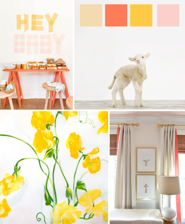
Things stayed that way into the first several months of my pregnancy — I saw things I liked, and even designed the following board which used some of my favorite colors, but nothing ever felt quite right.
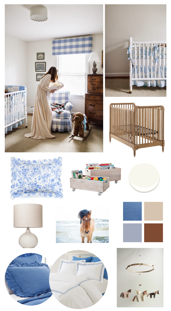
Then I stumbled across this nursery, and instantly fell in love. We didn’t know yet whether we were having a girl or boy, but I knew I could make it work either way.
Jessie gets the lion’s share of credit for my inspiration above — we will be using the same buffalo check fabric, the same light fixture, and similar crib bedding as she did. However, since our room is for a little lady, we’ll be adding a few horse accents — I was completely horse crazy when I was younger, and my Dad grew up on what is now a horse farm. (Actually the oldest continuously working farm in Connecticut! I love having that heritage as a part of her space.) I also think the toile and floral patterns make the overall look a bit more feminine in our rendition.
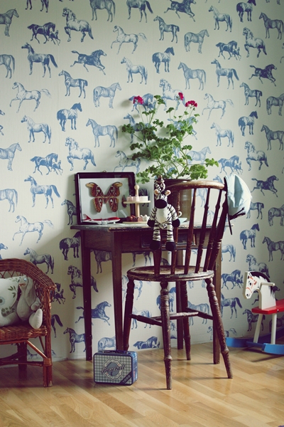
I seriously considered wallpapering one wall once I stumbled across the adorable Collette pattern from Sandberg Wallpaper, but alas they have discontinued the blue colorway:
from this blog
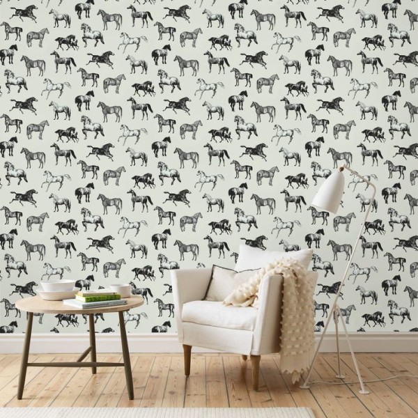
They still carry a lovely black colorway, but it’s not right for this room:
After total inaction for the first six months of pregnancy, the last week or so has been a whirl of progress! My Dad painted the walls (Benjamin Moore Simply White), we’ve assembled the crib (the same Jenny Lind beauty my sisters and I used as babies, unearthed from my parents’ attic!), and we’ve purchased a light fixture, a blue toile crib skirt, and a lamp. Next on the list? Switching out the light fixture, choosing a glider, deciding on window treatments (should we do drapes or a pelmet box like this?), ordering bedding for the twin bed that will also be in the room, and deciding on artwork. I am hoping to scrounge up some vintage photos of my family’s farm and horses; I also love the print from Minted in my inspiration above.
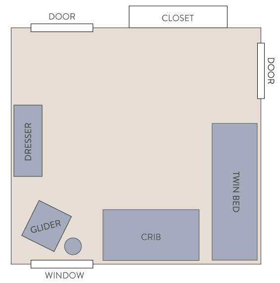
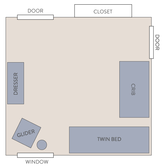
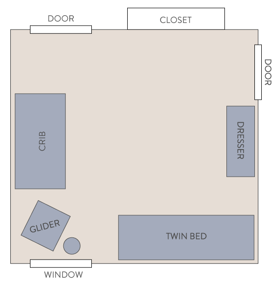
I’d also like to settle on a room layout. Here are the three options we’re considering:
Option 1: Not sure if having the crib and bed that close together is ideal, even though no one will be sleeping in the twin most of the time.
Option 2: Same issue with the bed and crib, though there might be a little more wiggle room.
Option 3: This layout allows more room between the beds, but I don’t know if having the crib so close to the door is a good idea?
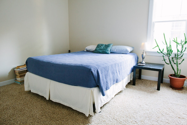
Just as a note, the door on the right-hand side is a little mini door to our attic storage. And as a reminder, here is the room “before:”
I think that’s about all I have to report for now! I’d love your thoughts and feedback, including on my current decisions, if you’d like:
— Drapes or a pelmet box in blue buffalo check for the window?
— Room layout 1, 2, or 3?
Thanks, friends!!







Wow!! what gorgeous inspiration, I can’t wait to see the end result :-) I’ve always thought drapes are more feminine that a pelmet box and easier to spring clean as well. As for the layout, option 3 allows you to just peak in as you walk by :-)
That is my absolute favorite nursery too. She did such a great job with it. I think the pelmet box for the window because the glider will be right beside it and you don’t want the drapes getting caught up in the glider as you’re rocking. I like layout option #2. You’ll more than likely be feeding baby girl in the glider, so it’ll be easy to get up and change her with the dresser/changing table right beside the glider. Based on the layout above, it also looks like the glider might be too cramped in the corner with the twin bed and crib on either side.
The pelmet box would be cute, but I suggest drapes for light-coverage reasons. I’m sure you could just close your blinds, but I’m quite protective about naps, so I’d do almost anything to increase the odds of teaching my baby to be a good napper. Any of the layouts look fine to me, but I’d probably go with #1 because it keeps the crib away from the door (so you can sneak in and peek at her without the door-opening sound waking her up). Also, if that little circle beside the glider is an end table, you can put your white noise machine there and it’ll be closest to the crib in layout #1. I am a believer in very loud white noise for new babies. (can you tell I’m a bit obsessed with getting my child to sleep? I love her, but putting her in bed with the knowledge that I have several hours to myself in front of me is the BEST feeling in the world)
I like the pelmet box from a safety perspective (this is what we went with in the nursery for my 3 month old son). As is mentioned in other comments though, I agree that curtains are much better from a light blocking perspective.
I vote option 2. Having the crib further from the window means that baby has a little less light when they’re napping in there during the day (there was no way to avoid having our crib really close to a window and I dislike this about my nursery). Also, having the dresser close to the glider means it’s easy to grab a burp cloth or blanket while feeding baby (something I love about my nursery). We keep our sound machine on the floor just underneath the crib so we can tap the button on top with a foot while putting baby in his crib.
I’m totally a drape lover, so that is my vote! And I LOVE the lamp you purchased for the room, beautiful!
Beautiful nursery…..but please make sure that the vintage crib is current for safety standards. Drop side crips are not acceptable anymore.
As a photographer, I would lean towards the crib being close to the window because you’ll surely love to snap iPhone photos of sweet girl napping! That window light will make your photos much better :)
So fun to see your nursery plans coming together! I’d go with drapes because they a) are a little more feminine, b) it looks like you have a large window and I think the drapes would help give the room shape, and c) because having drapes + blinds helps block more light. Also, I love option #3. I can’t wait to see the progress!
Precious, precious, precious :) And I still can’t believe you were already pregnant when I asked you that–I had no idea!!
So so sweet! :) I think I’m voting pelmet box purely on a design perspective + less fabric = less $ :) I also think I’m voting arrangement 2, I love when you walk into a nursery and see the crib right away as a focal point!
I vote drapes for the same reasons Katie posted. I love option 3 as well :) I’m obsessed with buffalo check :)
3 has great spacing!
I am too looking to use Jessie’s nursery as inspiration! Could you share the details of the buffalo check fabric?
@NMH It is from Calico Corners!