8 August 2012
Yesterday I showed you the process of designing our invitations with Jess at Magpie Paper Works, and today, I’ll share the final product!
Like I said, there were a few aspects of our invitation design that made it difficult to print to a high standard:
1) The PMS color we chose is prone to scuffing
2) The tri-fold exaggerated the scuffing
3) The protective varnishes that help prevent scuffing give the surface a dull sheen, which is something I was very much against
4) I was also very much against cracking along the scores
5) The PMS color and protective varnish both take a very long time to dry
Jess was so persistent in finding the perfect printer to complete this job, and though the process took longer than we both would have liked (with her sending the design out to multiple houses for a sample print), I would say it absolutely paid off in the end. No scuffing, no cracking, no sheen – I couldn’t be happier! Evolution Press in Seattle was the magical printer that made all the goodness happen.
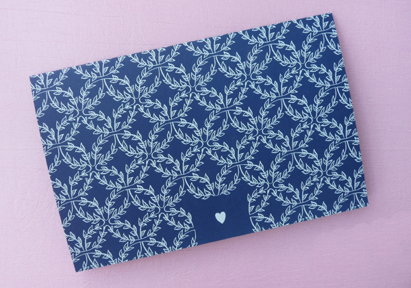
Ready to see? Okay! Here’s what guests saw when they pulled the invite out of its envelope:

I love that sweet little heart! Jess drew the boxwood vine pattern — isn’t she amazing?
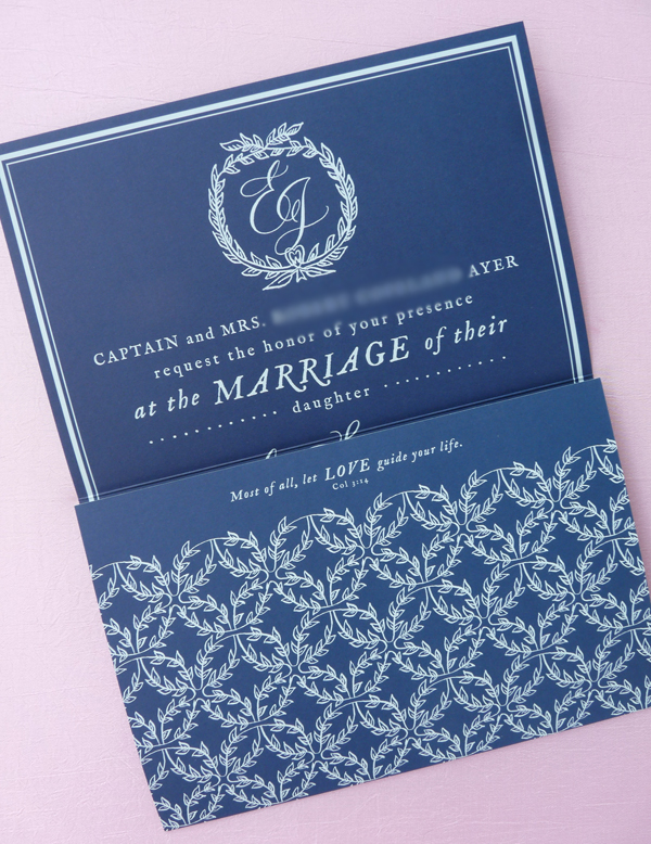
Let’s open the first flap, shall we?

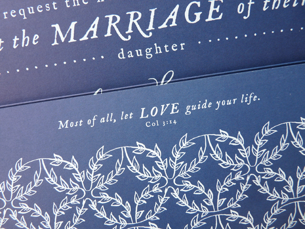
Love the unexpected verse! Full of surprises, aren’t we? :)

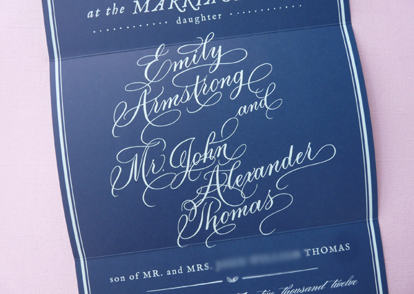
Once both flaps are open, here’s the full invitation, measuring a larger than life 9×18 inches!

I love it!! Now is the perfect time to give some major kudos to our calligrapher, MM Ink. I think Moya’s work is just incredibly beautiful — classic, while still having personality — and I absolutely love her penning of our names.

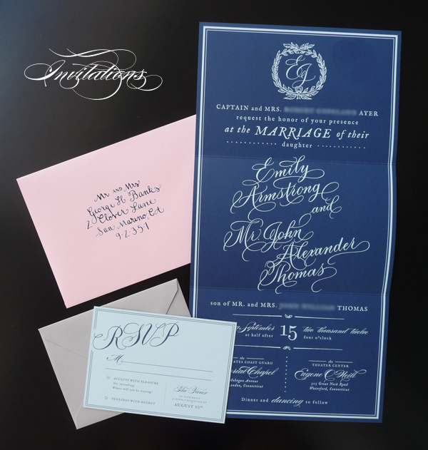
Here’s it all together. We chose light pink envelopes for the invites, and dove gray envelopes for the reply cards, both from Paper Presentation (my favorite!). Thought it can’t compare to Moya’s gorgeous calligraphy, I was pretty pleased with how my lettering turned out for our guest addresses.

What do you all think? I hope you love them as much as we do!!
7 August 2012
Hello, friends! As you know, our wedding invitations have flown the coop, so now it’s time to share! I thought it might be fun to walk you through the process today, and then show you the finished product tomorrow.
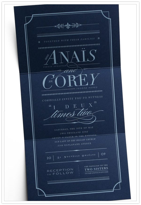
Like getting married in Connecticut in September, a love for a particular wedding invitation I saw three (yes, three!) years ago was one of the only things I took into planning this wedding. Here it is:

This beauty is a collaboration between I Am Always Hungry, Birdie Birdie, and Battery. My favorite parts? The light type on a dark background, the beautiful mix of fonts and neat typography, the size, the fact that it folded, the clever wording, and the overall classic aesthetic.
So I tucked that inspiration away for a few years, and when it came time to design our invitations, I pulled it back out. I had been warned by a few graphic designer friends that there were certain aspects to this design that made it a very difficult print job, so I knew that this was not a project I was going to be able to tackle alone. The first and only graphic designer I thought about working with was Jess from Magpie Paper Works. I had had the pleasure of working with her on a work project, and loved her clever but classic aesthetic (sound familiar?) and her cheerful attitude.
Having now gone through the whole process with Jess, there are so many things I appreciate about her, and I’d like to list a few here:
1) She was eternally cheerful, and unfailingly as excited about our invitation as I was
2) She was sensitive to our budget, and delivered within our (admittedly smaller than ideal) parameters without ever making me feel like it was a burden
3) She is clearly passionate about her craft, and I loved her clear and concise explanations of the different steps in the process. There were no smoke and mirrors – everything was totally above board.
4) Best of all, and most importantly, she took my inspiration and delivered a final product I love even more. Genius!
After we decided to work with Jess, the ball started rolling quickly. I can’t remember what order, exactly, these steps happened in, but in quick succession, we:
— submitted a deposit (50% of the estimated total cost)
— sent Jess a folder of inspiration
— filled out Magpie’s “client welcome form”
This form asked for the usual suspects, including our basic contact information and basic info about our wedding events (ceremony start time, etc.). We also answered a few questions about our style, and rated ourselves on a scale of 1 to 10 for a few questions: how traditional are you, with 10 being “most traditional” (6), how rustic is your event, with 10 being “formal” (8), how whimsical is your event, with 10 being “serious/reserved” (4), how colorful is your event, with 10 being “lots of bold colors” (6). It was fun to think things through like that!
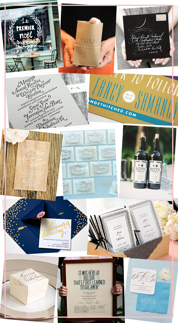
Here are a few of the inspiration images I sent:

Top to bottom: window decal via Design*Sponge; “yum” bags from Martha Stewart Weddings; white on black envelope by Mr. Boddington’s Studio; black on white invite by Perky Bros, “fancy but not schmancy” by Bird & Banner; wooden invitation photo by Jose Villa; rice packets from Martha Stewart Weddings; gold and navy invite by Plurabelle Calligraphy; black and white programs by Mr. Boddington’s Studio; marriage certificate by Orleans Paperie; calligraphy favor box by Martha Stewart Weddings; coaster and napkin calligraphy by MM Ink, design by Magpie Paper Works, via Southern Weddings (photo by Katie Stoops)
And, of course, the IAAH design above – Jess knew all about that one. Again, lots of typography, beautiful calligraphy, cheeky wording, wreaths, fairly clean and classic design.
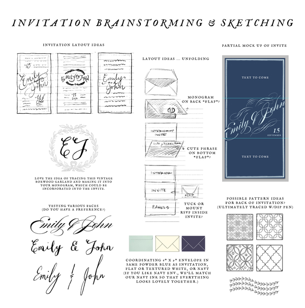
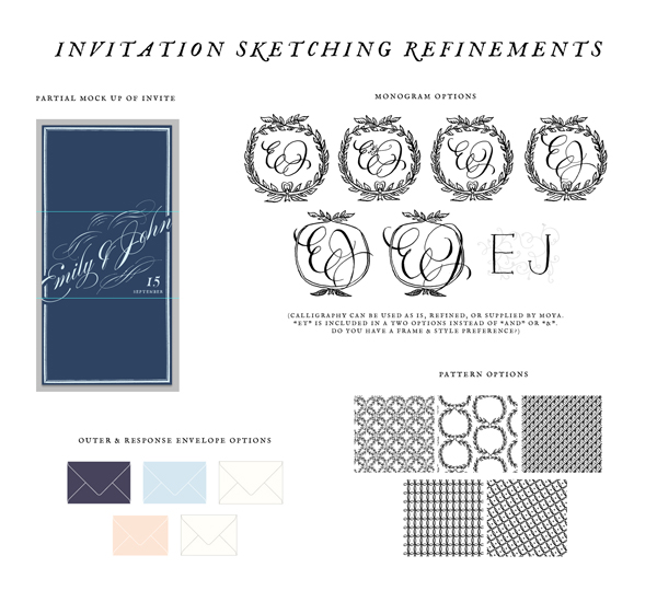
Taking all of the above into consideration, Jess sent us this board as a first stab.

Whee! Already so exciting! We sent back our thoughts, and here was round two:

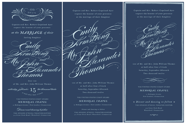
In round three we saw full invitation designs for the first time. Here are three of the six Jess sent over:

Jess took our feedback and presented round four, which included four options. Once we chose our favorite from round four, rounds 5, 6, 7, and 8 were just a series of small tweaks – the basic structure remained the same. Round seven also introduced the RSVP card, which was easy once the invitation was well on its way!
Whew! I think that’s quite enough for one day! Back tomorrow with the finished product, and more details about the ordering process!
3 August 2012

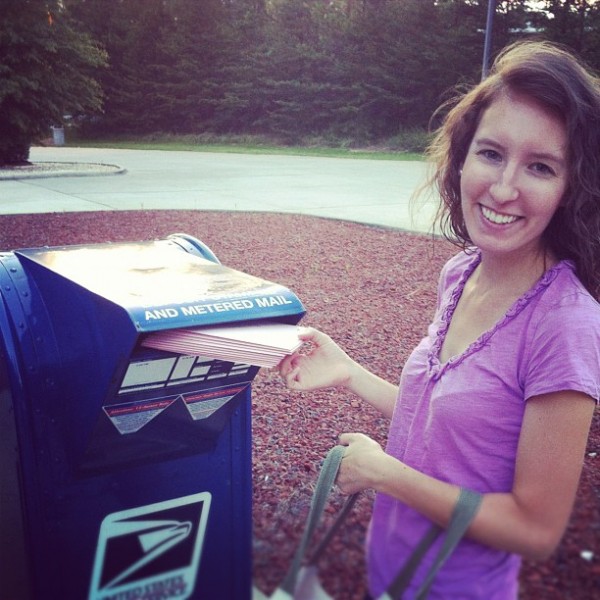
Pretty quick turnaround, eh? I wasn’t able to give these babies quite as much TLC as I would have liked, because I’m already concerned about how late they’re going out (less than six weeks before our wedding day, and just 15 days before our RSVP deadline – yikes!), but I’m sure they’ll arrive just fine! Really wish I could have hand canceled them, but such is life.
On the docket for this weekend: A goodbye party for a friend (the first friend I made outside of work in NC — sniff sniff), a morning at our church’s community garden, more calligraphy, finalizing our ceremony details, and LOTS of wedding projects. Seriously, y’all, we are buckling down around here. I hope yours is wonderful!
2 August 2012
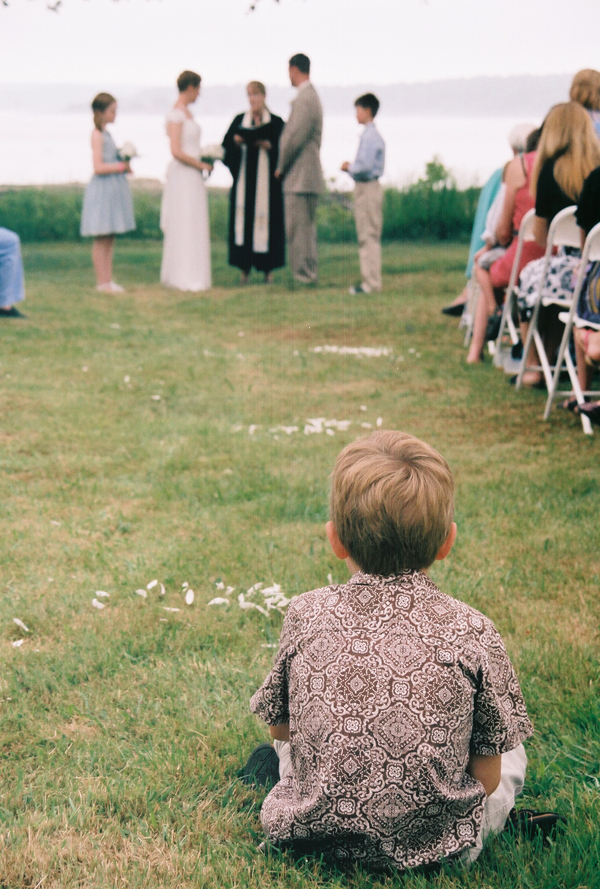
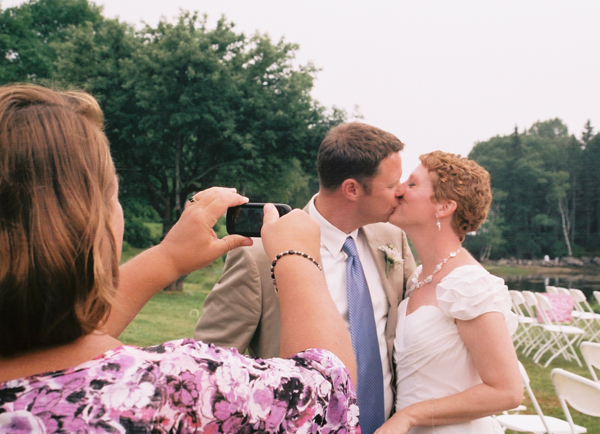
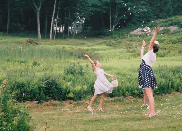
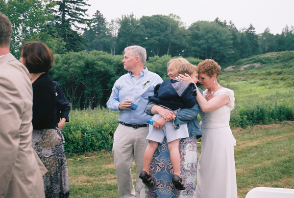
As promised, here is a recap of the first of the three weddings I attended in June/July (see the first one I covered here). The difference this time? I was the one providing the photographic coverage!
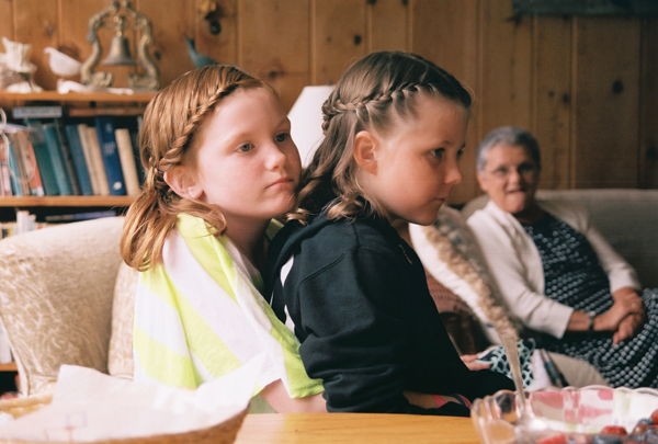
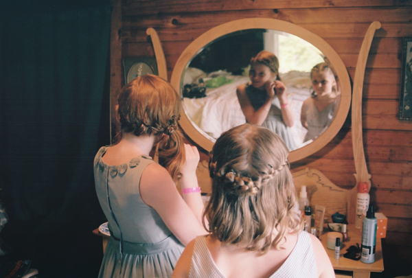
Those of you who know me know I am VERY much a fan of hiring the best photographer you can afford for your wedding. (Clearly – we hired Tanja!) There are so many reasons for not using a friend or relative, but I know y’all know them so I’m not going to list them out. That being said, my uncle and his fiancee had already decided that a professional photographer was not in the budget for them (it was a second wedding for both), and so when they asked me to step in and do my best, I obliged. I would have felt much more confident with John at my side and with both of us shooting (between you and me, he’s the better photographer :), but I’m pretty happy with how things turned out. I thought you might like to see a little peek at what I captured!
Note: All of these photos were taken with our Canon 35 mm film camera except the final one, which was taken with our Nikon digital camera (not a DSLR, but not a point and shoot, either). I switched back and forth between the two all day, and used about 8 rolls of 24-exposure film.


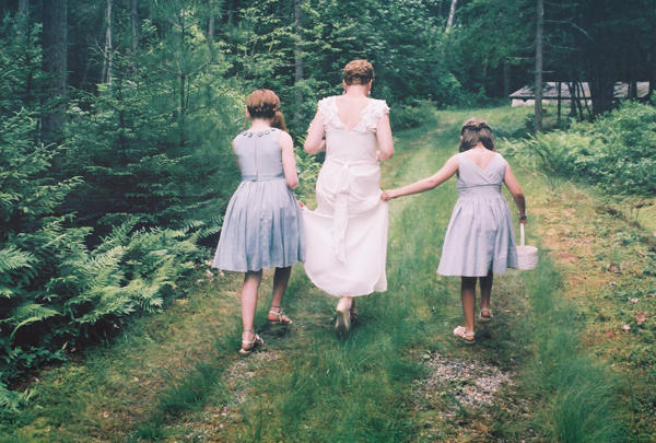
Love this one! Those flower girls were very concerned about not getting her dress dirty.

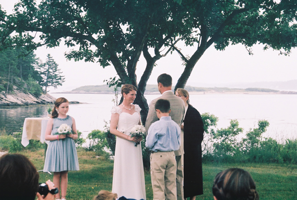
Though I’m pretty happy with this photo, the ceremony presented the biggest photography obstacle of the day. The ocean in the background was much lighter than the couple in the foreground, and when I lightened the photos enough to get a good look at their faces, the beautiful background ended up getting blown out. Ah well.

So cute :)


This one was definitely a lucky grab – I spun around and snapped with the film camera, and it ended up turning out well.


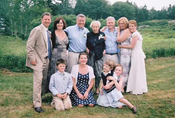
Really, really love this one, though I can’t take much credit for it! Their outfits are so cohesive without being matchy-matchy, and they all look so comfortable together! You know how I feel about family portraits.


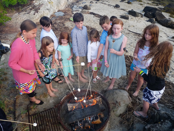
S’mores on the beach… every wedding should include them, don’t you think?
P.S. Our foray into wedding videography

