September 2025 goals
Big update over here, friends: we are under contract to buy a new house.
!!!
This came to pass in a quite unusual and stressful manner, because the house went on the market while we were in Maine. (Our realtor, to boot, was also on vacation.) We submitted our offer on Sunday night, learned there were multiple offers and submitted a new offer (and then another one) on Monday, and finally found out our offer was accepted on Monday night. We came home on Wednesday night and saw the house for the first time on Thursday night.
While we hadn’t stepped foot inside, we were familiar with the house – it is in our same neighborhood, right around the corner from one of Shep’s buddies, and is one we had had our eye on for over a year. It checks a lot of our boxes – cul-de-sac location, flat driveway, separate dining room, bigger backyard, space for an office, even the possibility of a mudroom – and we are super grateful.
That does not mean that the last few weeks have been without challenges. I wish I could say we’ve been uniformly blissful and brave, but alas I am a person who deeply dislikes change. In addition to staying on top of the piles of paperwork required to buy and sell a home – as well as fixing things up around our current home, coordinating completion of the rest of the punch list, streamlining our belongings and beginning to pack what remains – I’ve been on a bit of an emotional roller coaster. I am excited, of course, and grateful, but also fearful of leaving the security of our current corner of the neighborhood and all the good we have here, fearful of something “better” coming on the market in the future, and fearful of the unknown ahead.
However. I am purposefully trying to step off the roller coaster of emotion and take up a new posture, embodied by one of my favorite mantras: make a decision, and then make it the right one. It is somewhat embarrassing to admit that I am having to gear myself up to feel anything but grateful for such a blessing, but here we are.
We close on the new home and list our current home in early October, so this month will be full of preparation. Here’s what else is ahead:

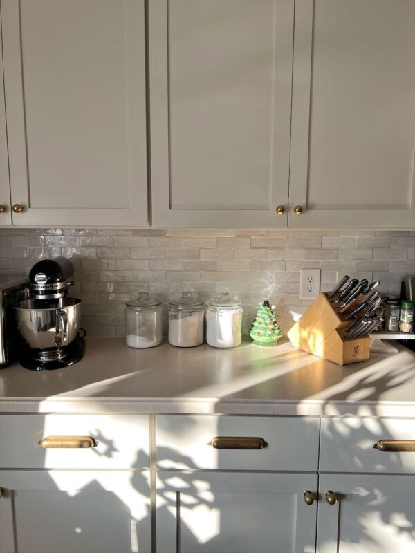
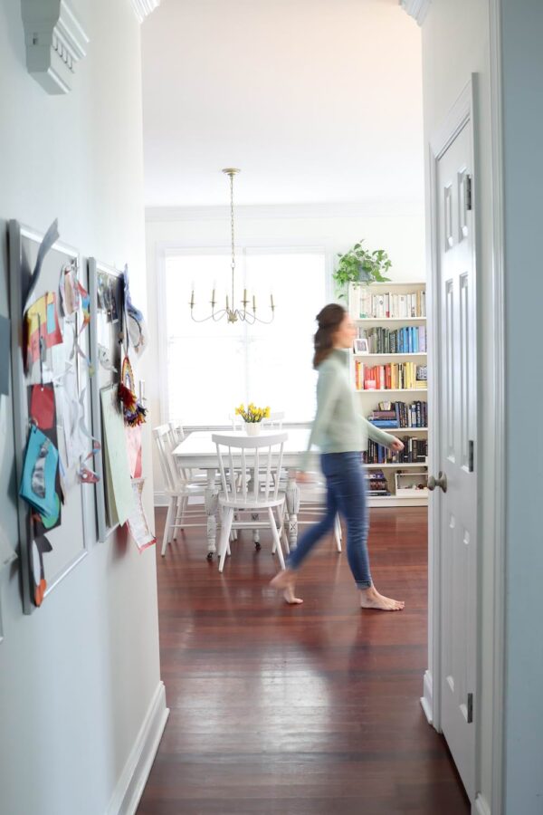
A view from our island!
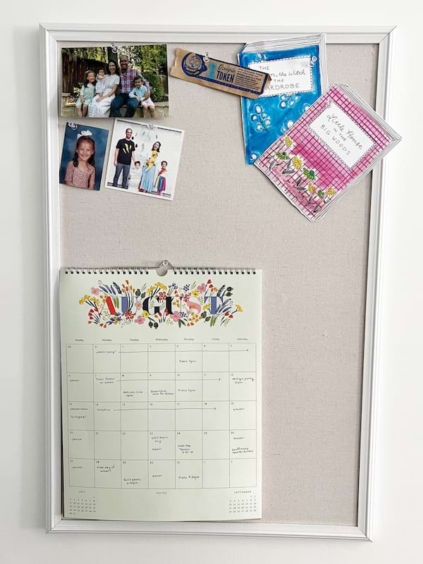
On my calendar:
— A Durham Bulls game! We try to go at least once a year and are all hoping this absolutely delectable weather we’ve been having holds until our game.
— Camping with the Rays! Our annual camping trip is 12? 13? years strong at this point – something we look forward to every year. And now with 8 kids!
— An anniversary weekend away. With thanks to my parents for staying with our kids, John and I are incredibly excited to have some time together in the mountains of NC to celebrate our 13th wedding anniversary.
What I’m loving right now:
— When my Blueland cleaning spray bit the bullet (again – their nozzles are notoriously finicky) I gave up and chose a random Method spray from the store. I’m in love. It smells a bit like the Thymes Frasier Fir candle, but not quite as Christmas-y? Wiping down the dinner table and chairs is one of my least favorite household tasks; leaving this scent in my wake makes it positively pleasant.
— Another lucky grab from the store: Wild refillable deodorant. After my beloved Toms deodorant was discontinued, I mooched off of John’s Native deodorant for a bit, but it never worked well for me. The Wild Honey + Cactus scent, on the other hand, is a revelation – it works SO well. I think natural deodorant tends to be highly personal, so take this recommendation with a grain of salt – but it might be worth a try! I also love that it’s refillable and that the (cute) holder is metal.
— In a bid to switch up my routine and sharpen my focus, I’ve been working from the library on my TCF mornings. I drive over in silence, drafting in my head, then post up in one of the armchairs by the window, scoot in the little laptop table, and happily tap away for a few hours. Bonus: it’s easy to scoop up any books we have on hold!
As a reminder, you can find allll the things I’ve loved over the last few years neatly organized right here!
What you’re loving right now:
This is where I highlight a few items here that have been popular in the last month with fellow readers, based on my analytics. Here’s hoping this will help you find something you’ll love!
— These slim ice packs that fit perfectly in a lunch box and keep things cool until lunch time
— John’s favorite work button-down shirts and beachy sweatshirt
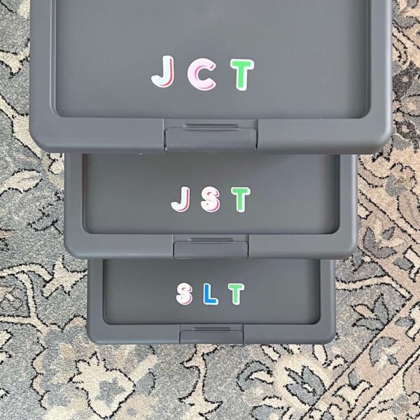
— The underbed boxes we use to store kid memorabilia and memories
— John’s standing desk (it’s as attractive as one can be, but I’ll still be happy to have it out of our bedroom in the new house!)
Last month on The Connected Family:
— The willingness to live a life of long-term, intentional repetition | Lessons from my Dad
— Friendship before social media | True friendship doesn’t need to be quantified or transacted for others
— A day in the life of the Connected Family | The summer, Substack writer, workday edition with a 9-, 6-, and 3-year-old
— Back to school rituals for connection | Communicating love, affirmation, and warmth in small-but-mighty ways
— It’s party time | How working hard together brings connection, belonging, and significance
What I read in August:
— I Cheerfully Refuse | This was a read that lingered from July to August, so I’m back with my final review. And it is: eh. The dystopian future setting was more depressing than the hopeful I was promised on the book jacket, and that’s not really what I’m looking for right now. I did finish it, but wouldn’t necessarily recommend it.
— The Self-Driven Child | I first read this in the weeks after Annie was born and loved it. I also noted at the time that it was a book I’d want to return to when my kids were a little older. Four years later, here I am! It holds up, and I gleaned even more wisdom and practical tips this time around – and I still consider it one of the most underrated parenting books out there.
— Run | I almost didn’t review this one, but since it’s on my reading list I’ll go ahead. In short, I would say: not for me. Thrillers are not usually my genre, but add in a rage apocalypse and a good amount of gore and I was left wishing I hadn’t included it on my list. Yes, it kept my interest and yes, I was grateful for the plot resolution at the end, but I also closed the book thinking, I’m not really glad I read that, you know?
My reading list for 2025! I’m 10 / 24 so far.
Revisiting my August goals:Clean out pantry
Edit June in June (I hate that this got bumped again! I really try to have the last one edited before we start filming for the next one!)
Make a watercolor painting en plein air while I’m in Maine
Help my Dad get his Storyworth off to printFinalize new chore charts for the new school yearSchedule and enjoy back-to-school shopping dates with the two bigs
Complete Shep’s baby book
It’s worth noting that my priorities shifted in early August, once we knew we would be buying and selling a house!
September goals:
— Prepare our home to go on the market
— Pack and transport everything we don’t want in our home for listing/showings
— Book help and figure out details for the first few tasks we want done in the new home (painting, backsplash, light fixtures, etc.)
— Edit June in June
— Film Sheptember
— Make apple cider scones for the first day of fall
— Sort and tag for the consignment sale
— Experiment with drafting Substack Notes for the week, each week, in advance
As a reminder, many of these are drawn from my 2025 PowerSheets goals!
Friends, help! The last time we moved was 12 years ago, and it was from an apartment to a first home. We had no kids and far fewer belongings, plus we weren’t trying to sell a home at the same time! Please give me all your tips – anything you did (or wished you did!) that made buying, selling, or moving easier. I’m all ears – thank you in advance!
Affiliate links are used in this post!

