17 September 2014
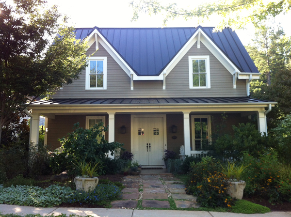
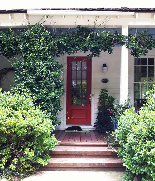
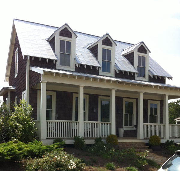
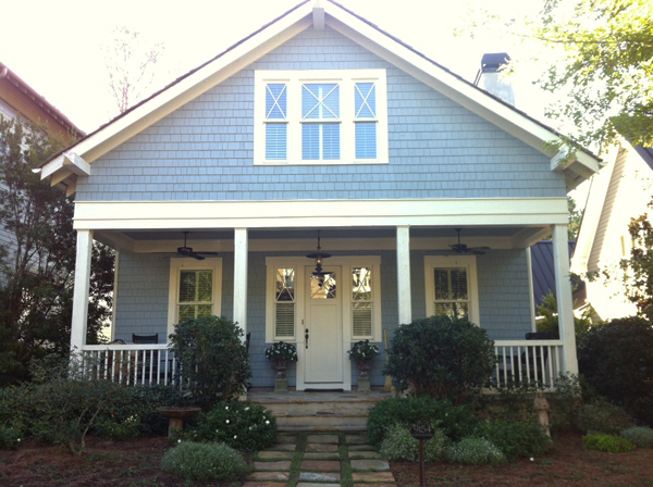
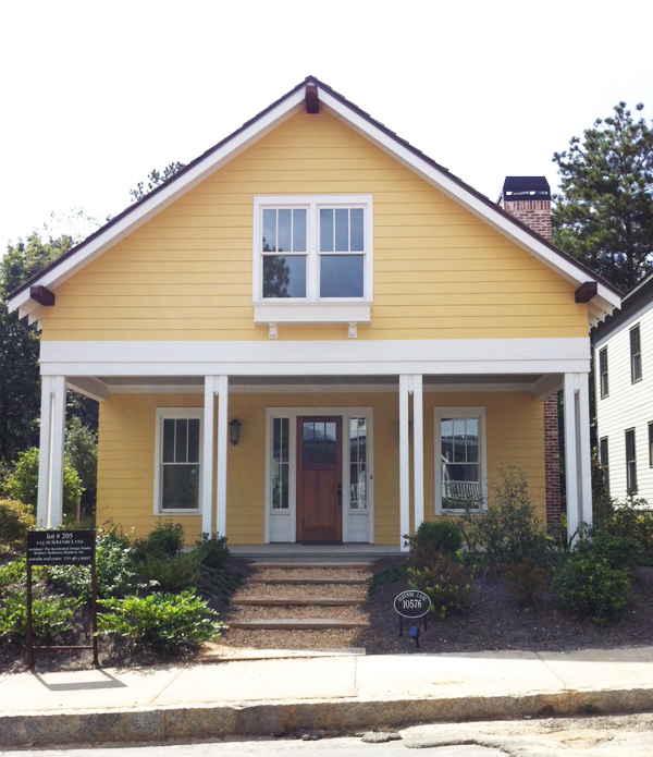
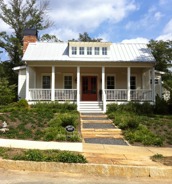
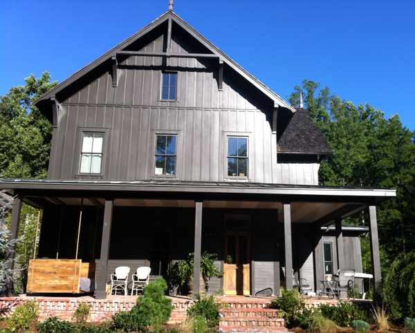
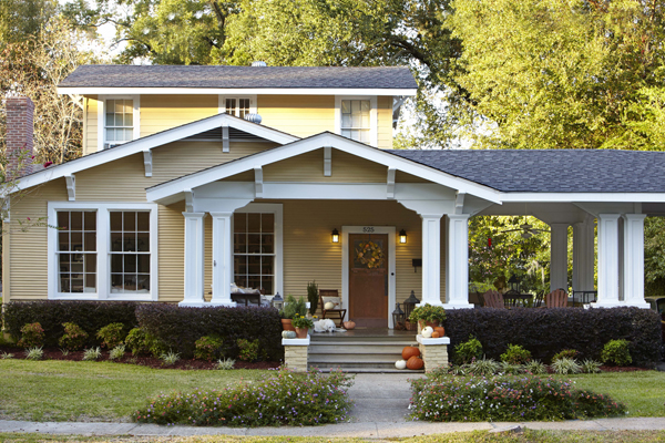
I’ve mentioned the magical land of Serenbe before, but basically, it’s as close to an idyllic planned community as I can imagine. There are homes, a few restaurants, adorable shops in little “downtown” pockets, a farmer’s market and organic farm, an Inn, stables, nature trails, edible landscaping (blueberries planted along walkways!), an outdoor theater, and community in-ground trampolines. Yes. And aside from all that, everything – and I mean everything, from the trash cans to the real gas lamps lining the streets – is impeccably designed. I snapped a few house photos on my last trip (not creepy at all) and couldn’t resist sharing them here!


I sure do love a good bungalow. Which one is your favorite?
18 June 2014
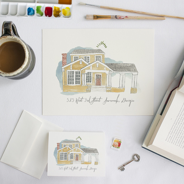
California posts will resume tomorrow, but I had to take a small break to tell you about something time-sensitive! Southern Weddings is currently hosting a giveaway for a custom home watercolor by Lucky Luxe, and if you adore Erin’s work as much as I do, you must drop everything and enter immediately!!


Erin’s watercolors are very much in the style of Rebekka Seale, which I love, because I was fairly obsessed with Rebekka’s house illustrations. Erin loved them, too, and when Rebekka stopped doing them, Erin asked her if she’d mind if she picked up where she left off – and Rebekka gave her blessing, thankfully for all of us!
The giveaway is open until Friday – go here for all the details, then post your photo on instagram to win! Seriously, I don’t know why there aren’t 1,000 entries already.
In the meantime, you should take a look at all of the posts in the Southern Newlywed series — I have been loving them! Just a few of my favorite moments:


I had to restrain myself from re-posting every photo of Erin and Ben’s home tour. It is that good, and the interview is even better. Go read it now, please.


I also loved Caroline and Aaron’s apartment, and their thoughts on small space living are inspiring!


I pinned many a photo from Landon and Jordan’s tour – and you must go see their adorable chicken coop!!
Lots of inspiration to be had!
12 May 2014
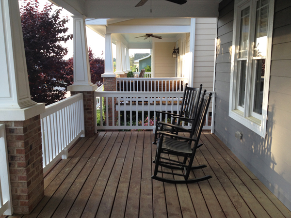
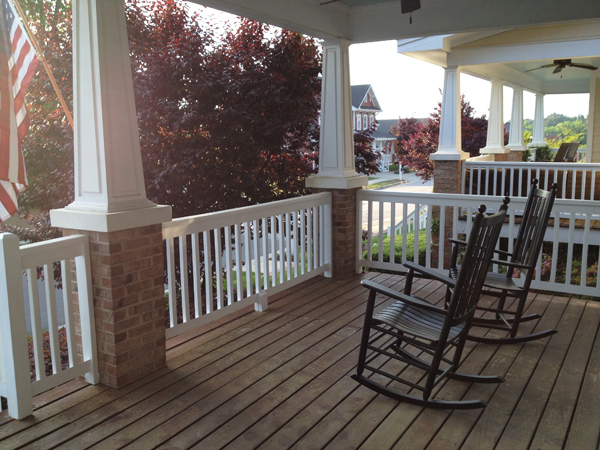
I’m not sure how typical this is, but when John and I moved into our house (about a year ago), we made very few immediate changes or improvements. We wanted to live with the space for a bit, and we also wanted to let our budget adjust to a mortgage vs. rent! Until last month, when we added handsome black rockers thanks to my in-laws, our front porch looked pretty much the same as the day we moved in:


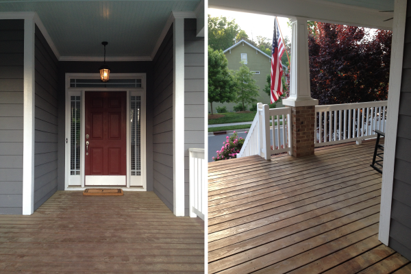
It’s a pretty good place to start, so I can’t complain! (Aside from the heavy dusting of pollen – thank you, North Carolina.) We love the haint blue ceiling, the columns, and the generous proportions. We don’t love the lack of privacy or the color of the front door. We would love for this to be a more comfortable space to hang out (it is one of my 60 Before 30 goals!), so we’re hoping to make a few improvements over the next few months. My inspiration:

A few of the things on our to do list:
— Paint the front door
— Add a planter with fern beside the door
— Hang string lights
— Add a side table between the rockers
— Build a trellis and plant something climbing for more privacy
— Hang a swing (!!!)
As you can probably tell, the swing is most exciting to me. John, however, is worried that hanging a swing will compromise the integrity of our porch roof (…?), so I have a little more convincing to do before I get the green light.
Most intimidating to me on this list is painting the front door – it just seems like such a big change! If it were you, would you go with poppy red, haint blue, or glossy black?
3 April 2014
This past weekend John and I had what I think of as the stereotypical homeowners’ weekend – we did little else besides checking off a long list of things on a household to do list we’d been adding to for several weeks. It was really good, actually, even though we did make eight (yes) separate trips to various home and garden stores in two days. Efficient we are not.
For us, a weekend like this is something to report on, since we don’t actually have them too often. John and I really love our weekends – we like to fill them with everyday adventures – and one thing we agreed on when we were buying our house is that we didn’t want to lose them to lawn care and home maintenance. Happily, we haven’t! Even so, we still need to get things done every once in a while.
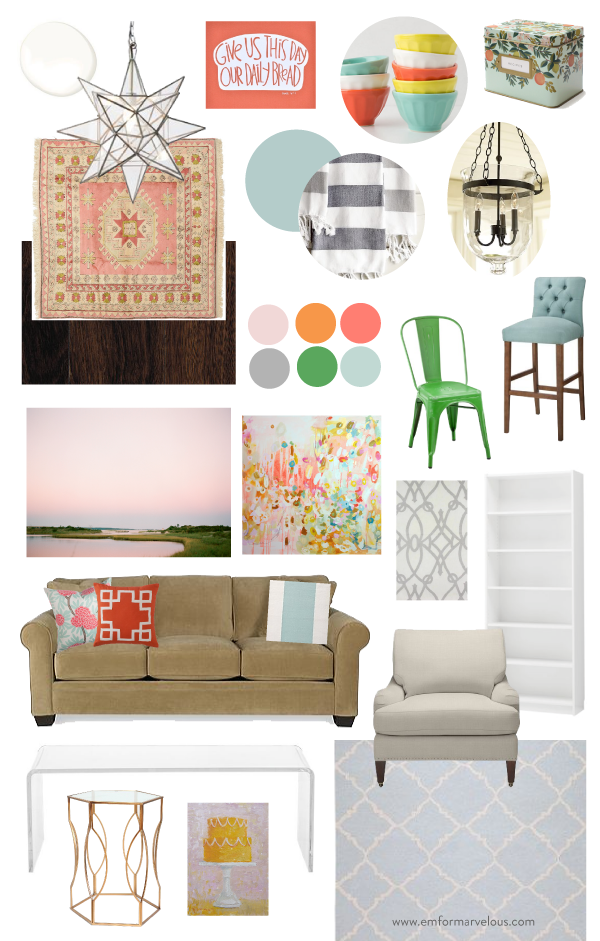
My relationship with our house this first year has been interesting, and I’m looking forward to sorting through those feelings and sharing them with y’all – hopefully in about a month and a half, on the anniversary of our closing. In the meantime, I thought it might be fun to share a bit about our whole house color scheme. As I’ve shared before, our entry, kitchen, dining, and living room are all open to each other, so when we make decorating decisions for any one room, we have to take the impact on the other spaces into consideration. Since we’re collecting things over time, the board below helps me visualize many of the elements – some of which we’ve already put in place, some of which we’re considering – together.

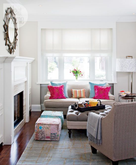
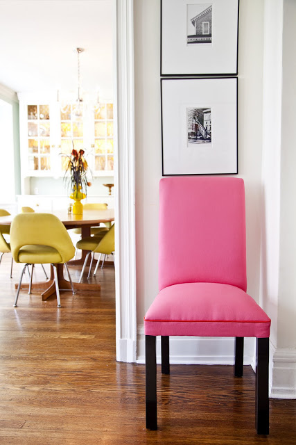
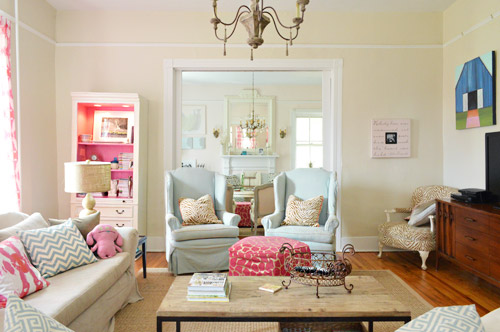
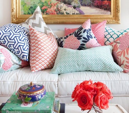
Though I am often drawn to neutral spaces (as you can see on my home Pinterest board), when it comes down to making a decision for our home, I almost always go for something more colorful — but with a classic base. Classic with a twist, if you will, just like what we were going for with our wedding!
Also, do these colors look familiar? They’re almost exactly the same as the ones I chose for Em for Marvelous! I guess I know what I like :)
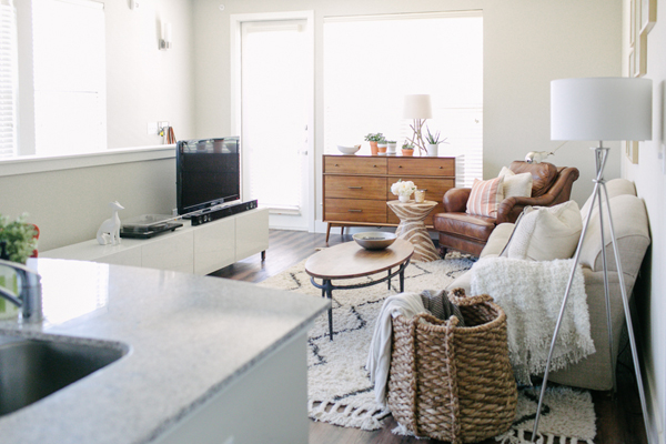
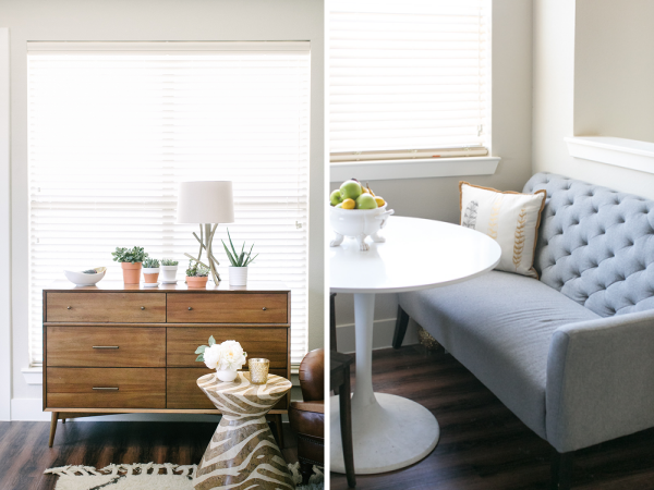
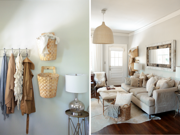
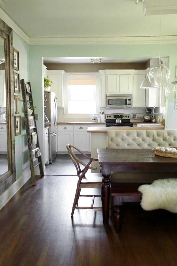
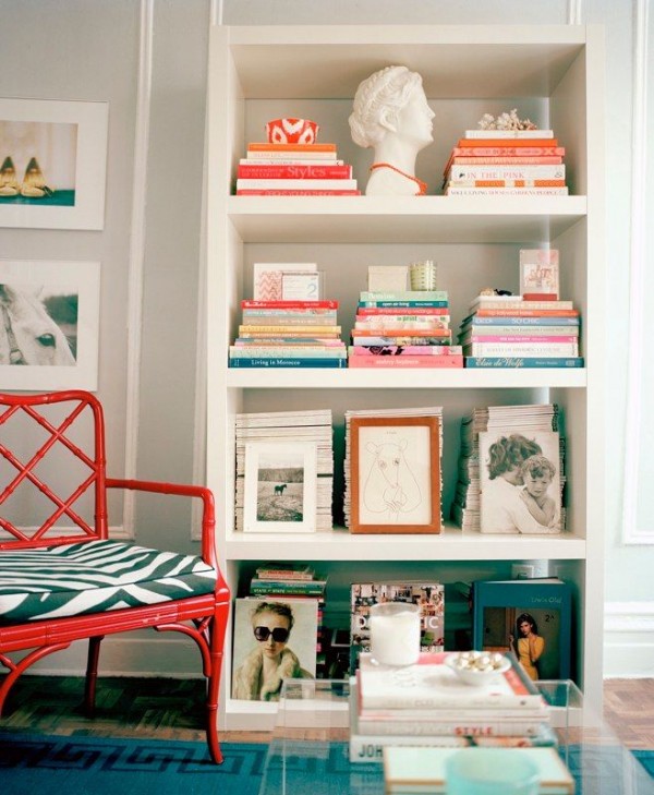
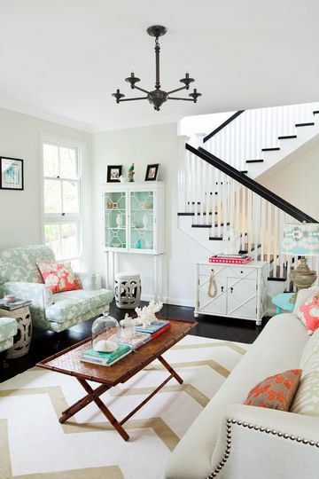
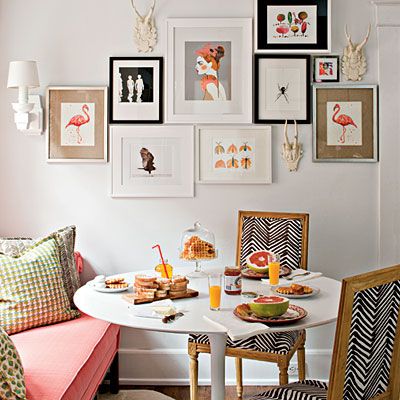
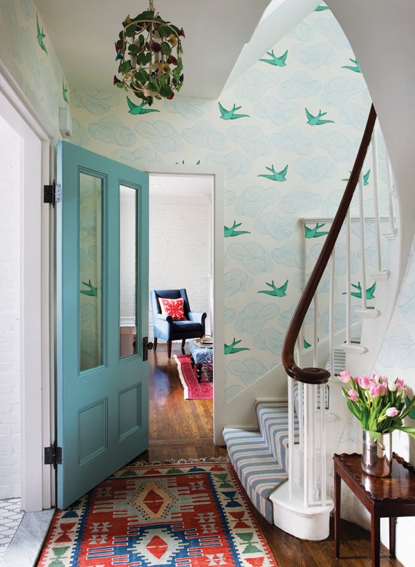
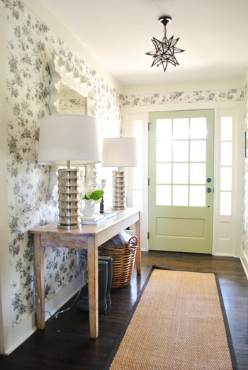
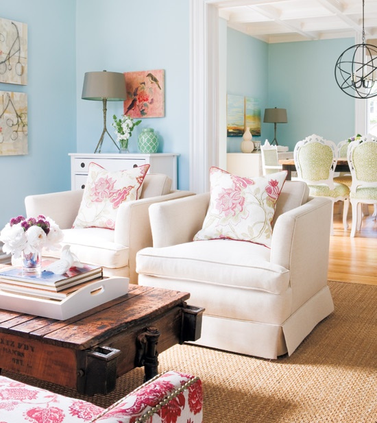
Here’s some more colorful and classic inspiration I’ve collected:

Jana Bek

Style at Home

Society Social

Young House Love

Caitlin Wilson

Lonny

Style at Home

Southern Living

Boston Magazine

Young House Love

Style at Home
Do you tend to gravitate toward neutrals or color? Or perhaps a more narrow palette than ours? I’d love to hear!

