16 March 2012
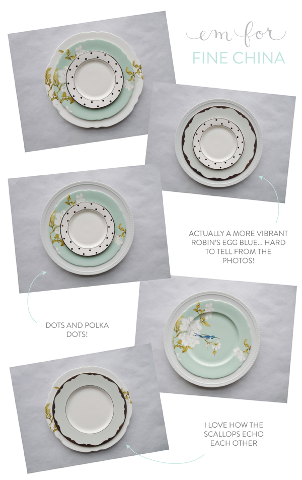
I really adore fine china, and I always assumed we’d register for it. And now we have! We didn’t go the traditional route, though, and opt for all one pattern, but instead have mixed and matched between a few. Since several of the patterns aren’t available at my local Macy’s, I decided to order one of each piece to make sure they all looked good together. And then I had fun playing :)

Here’s the breakdown of what we’re registering for:
— 12 “Staccato” dinner plates from Crate & Barrel (not technically fine china!)
— 12 four-piece place settings (dinner plate, salad plate, cereal bowl, and mug) of Spode’s “Nectar.” I wasn’t sure whether John would like this one, but he actually loves the birds!
— 6 Kate Spade “Trimble Place” salad plates
— 12 Kate Spade “Larabee Road” bread and butter plates
What do you think? Would you mix and match patterns like this if you were registering for china/fine china? Do you think our guests will be confused? :)
P.S. Remember when I wanted to register for green and gold china? Still love those patterns.
24 February 2012
We have officially crossed the halfway mark, my friends. Tomorrow is February 25, which means it’s been 8 months since we got engaged, and 6+ months until our wedding date! Whoa!

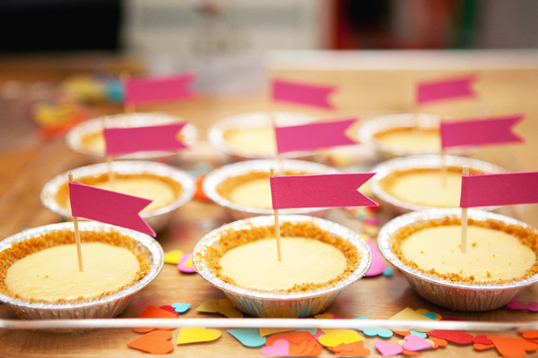
One more for my mini desserts collection… this one from Southern Weddings, photo by Jodi Miller!
Since my last update…
— I found a clutch (many thanks to a dear friend who’s letting me borrow hers!)
— We’ve gone through several rounds of invitation options with our amazing designer (more about her soon!)
— We finalized our room blocks for guests (tip: make sure you do this WAYYY earlier than we did!)
— We booked our band!! (Finally!)
— We booked a string trio for our ceremony.
— We placed a preliminary rental order for things like tables and chairs.
— We placed our order for lounge furniture (yay!).
— I took home a flea market find for our menu.
Next up on the list?
— Since we didn’t accomplish it last month, I’d like to get the ball rolling on groom and groomsmen attire.
— We have several able-handed friends that will be visiting us this month, so I’m excited to put them to work on some DIY projects! :)
— We’re all so ready to put the bridesmaid dress situation to rest. I sincerely hope we have those suckers ordered by the next time I update you.
Let’s see… when I asked on my last update what you wanted to hear about next, y’all said tent (check!), videographer (check!), first DIY project (I’m going to keep that one under wraps), and florist (haven’t covered that one yet — will do so soon!). Anything else you’re curious about?
22 February 2012
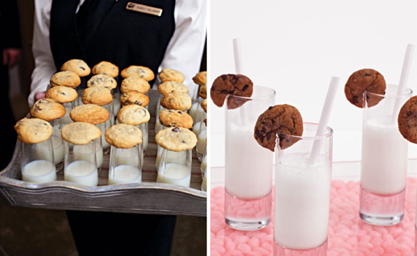
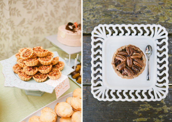
Though my love for mini food is well documented (namely, here and here), I don’t think we’ve spent enough time discussing mini desserts. They’re slightly more common than mini food, but these little beauties have a charm all their own. A few of my favorites:

Mini cookies – especially delicious served warm at the end of the night with shots of cold milk. (Photos: Bryan Johnson from Martha Stewart Weddings and Martha Stewart Weddings)

Mini pecan pies – perfect for eating on the go. (Photos: Gladys Gem via Style Me Pretty and Braedon Flynn via Southern Weddings)

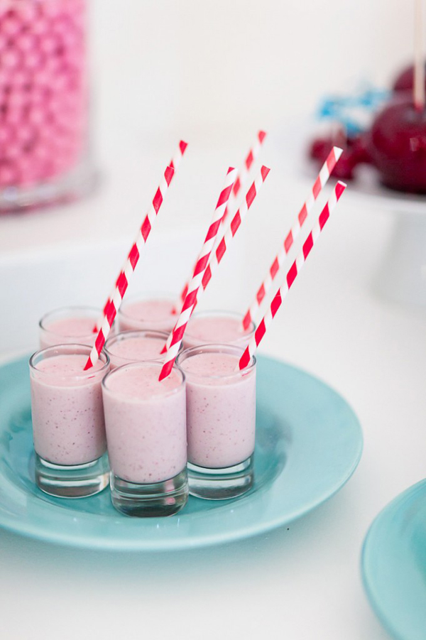
Mini milkshakes, complete with striped straws! (Photo by Julie Lim via Southern Weddings)

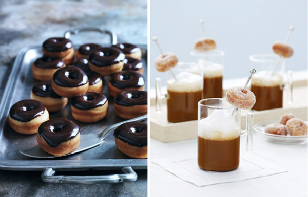
We talked about donuts at weddings once already, but I still love them. (Photos: Chris Court and Martha Stewart Weddings)

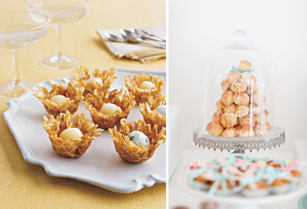
Two creative options: mini ice cream scoops in waffle bowls and cream puffs. (Photos: Martha Stewart Weddings and Julie Lim via Southern Weddings)

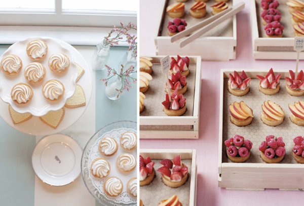
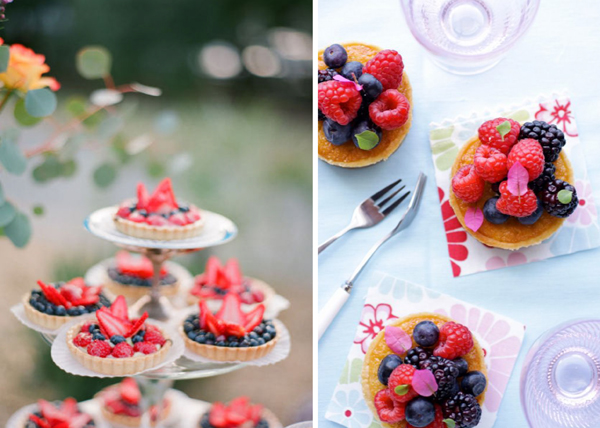
We will be having some mini desserts at our wedding, but I’m not going to tell you too many specifics because I want them to be a surprise for our guests! I will tell you that we’re definitely going to be serving mini fruit tarts. They’re John’s favorite, and one of his only requests! (Photos: Jessica Lorren via SW and Martha Stewart Weddings)

(Photos: Stephen Pappas via SMP and Cannelle et Vanille)
Is your mouth watering yet? :)
17 February 2012
Hi friends! I thought we might talk about our wedding website today. Not the most exciting topic (at least on the surface!), but I think we did something out of the ordinary, and I’d love to share. As fair warning, this is a pretty long, involved post, so if you’re not interested in making a wedding website for your very own self, you might want to skip this one :)

Photo by Anna Kuperberg; overlay by Em
So how did we get here? We wanted a website that would, first and foremost, be helpful to our guests in preparing for our wedding. Our second hope for it was that it would give our guests a taste of what was to come, and hopefully pique their excitement! To accomplish this, we wanted a site that fit with the feel of the celebration we’re planning, and was highly customizable. Oh yes, and as with most things, I was hoping it would be free, or at least inexpensive.
However, I didn’t really want to make a big production out of it, you know? So I began checking out wedding website companies, fully expecting to choose one for ourselves and call it a day.
Well, we looked at offerings from a variety of companies, including Project Wedding, Wedding Window, My Wedding, Wedding JoJo, and several others. I eventually decided on My Wedding, mostly because I liked that they offered Minted backgrounds.
But as I began to set things up and enter text, I just wasn’t satisfied. The Minted backgrounds were lovely, but the formatting of the text on My Wedding was just… strange, in my opinion. Dissatisfied, I let it sit for a few days.
Meanwhile, this post I had read almost four years ago popped into my mind. In it, Miss Lovebug details the process of turning a Blogger blog into a wedding website. I quickly re-read through her post, and figuring it sounded doable, abandoned ship with My Wedding and set about to create a custom site.
It took me about three hours to hash out the HTML, but I am happy to report that it was totally worth it, AND, even BETTER, that I realized at the end of those three hours a much easier way to make several of the changes. I would love to share the process I used, in case someone else is interested in doing something similar! Here we go!
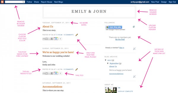
The overall goal is to make your Blogger blog as un-blog-like as possible. To do this, we must make several changes (which I’ve marked below). (NOTE: Since I am most comfortable with Blogger’s “Layout” template option and Minima template, that’s what I’ve chosen to work in.)

Let’s get started! First, let’s remove that pesky navigation bar. I used the instructions at this link, and they’re simple and easy to follow.
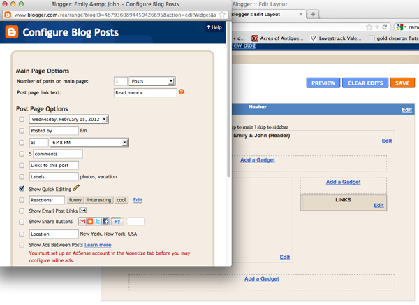
Now let’s remove the date header, comment function, social media links, and “posted by” thing. Click on the “Design” tab, then click on “Page Elements.” Click on the “Edit” link in the “Blog posts” box. Under “Post Page Options,” uncheck every box except “Show Quick Editing.” Also change it to show one post per page for “number of posts on main page.” When you’re done, it should look roughly like this:

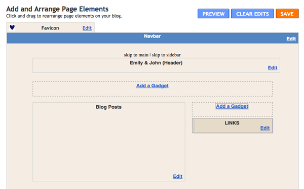
Next, let’s get rid of the existing sidebar widgets, and replace them with a single link widget. Click on the “Design” tab. Locate the “Add a Gadget” section, and remove all of the existing gadgets by clicking on them in turn and selecting “remove.” Now, click on the “Add a Gadget” button, and add the “Link List” gadget. I very helpfully titled mine “LINKS.” This will be the main navigation for your guests in the right sidebar. Your screen might look a little like this when you’re done:

Now let’s get rid of the “older post,” “home,” and “newer post” buttons, as well as the “Subscribe to: Posts (Atom)” link, that normally appear beneath posts. This link has a great tutorial for removing these elements.
If you haven’t already done so, now would be a great time to start populating your site with some content. Make a new post for every “page” you’d like to have on your site. For example, we have pages titled “About Us,” “The Proposal,” “The Wedding Party,” “Travel Information,” “Gift Registry,” “Get in Touch,” etc. Make sure you make a home or welcome page, too!
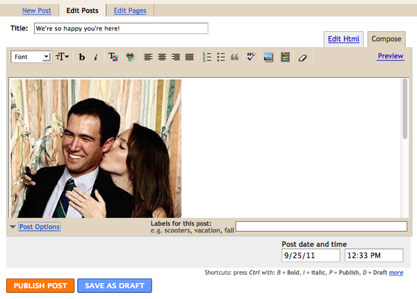
Once you’re done with your “posts,” go in and make sure that your welcome post is the most recent post you’ve published. You can do this by clicking on “Edit Posts,” then clicking “Edit” next to your welcome post. Click “Post Options” (near the bottom of the window), then change the date and/or time.

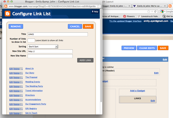
Now, let’s populate the Links widget we created before! To do this, open up the “Edit Posts” tab in one tab, and the “Design” tab in another tab. (So many tabs!) One by one (except for your welcome post), click to “View” each post, then copy and paste the link into your Links widget. You can change the order in which the posts will display in the widget, too.

At this point, hopefully your “blog” should look a little something like this:

Not very interesting, but not very blog-like, either, eh? Progress!
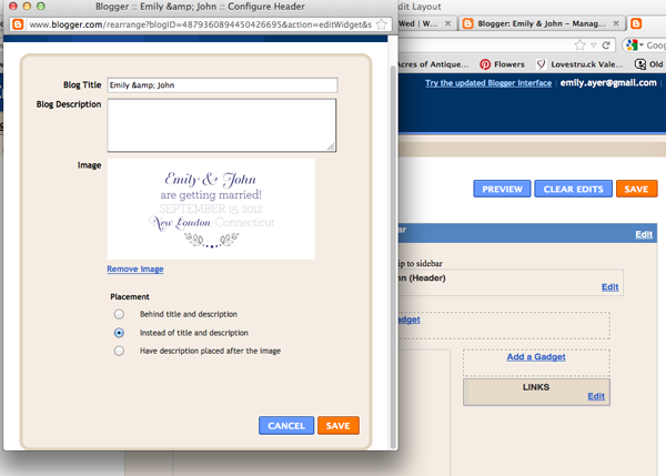
Now’s the fun part, where we’ll add in some pretty details to spiff things up! First, let’s upload a custom header. I made ours in Illustrator (and sized it to 800px wide by 400px tall), but you could use Photoshop, Publisher, or even Powerpoint. Once you’ve got your header saved as a .jpg, click on the “Design” tab, then click on “Edit” in the header box. Upload your header and choose “Instead of title and description” for placement.

You might like to remove the header wrapper like I did. Here’s the link where I learned how to do that.
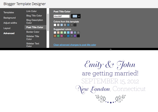
If you’d like to change the post title text color, click on the “Design” tab, then click on “Template Designer.” Click on “Advanced,” then “Post Title Color,” and choose your desired hue.

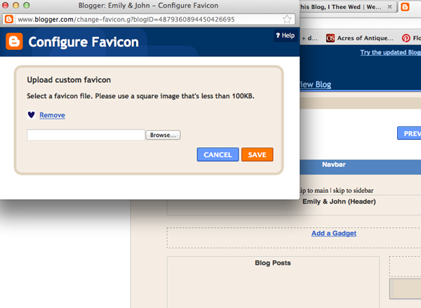
Blogger has made it SO easy to add a custom favicon, so there’s almost no excuse for not making one! I just made a little navy blue heart for ours in Illustrator. To upload your favicon, click on the “Design” tab, then “Edit” next to “Favicon.” Make sure to follow Blogger’s instructions in the box.
The final detail I added was to point our site to a custom address, so that it read www.website.com instead of www.website.blogspot.com (much easier to remember, and cleaner for save the dates!). I purchased ours through GoDaddy for $7.67 for one year. The normal price is a little higher than that, but I successfully Googled for a coupon code :) GoDaddy has very thorough instructions on how to incorporate your custom domain into your Blogger blog, so make sure to look for their tutorials after you make your purchase.
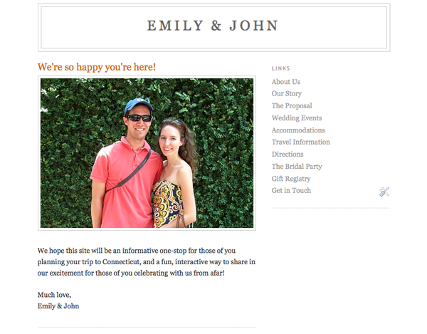
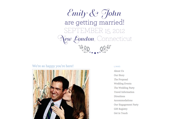
WHEW! After you’ve done all that, your site should look a little something like this!

Pretty pretty!
I love so many things about this Blogger “hack,” but the best might be that we can include video – meaning we have a fun way to share our engagement video with our guests!
What do you think? Would you try this for your wedding website? Feel free to email me or leave a comment if you have a question about any of these steps!

