27 November 2015
I hope you all had wonderful Thanksgivings!! Between our birth class, visitors, travel, big work events, Articles Club, birthday parties, our church family group, and showers, November has been an exceptionally busy month. I am so grateful for a few days off work and without activities to relax a bit — and tackle a few things that have been on my to do list for weeks!
One thing I did accomplish this month, though: finally pulling the trigger on new chairs for our dining table!! It should be well known around these parts that I tend to agonize over home decor purchases, especially ones that come with a large price tag. (For proof, see here, here, and here.) Though I think I have a strong design sense, I can’t help researching every possible option, and then second guessing everything a few times just for good measure. I’ve been researching and debating options for this space for about a year now, so it definitely felt good to finally make a decision!
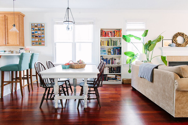
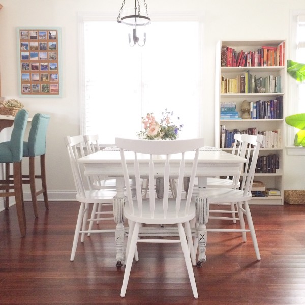
You can see where we started thanks to our most recent home tour:

Our former chairs were given to us for free (yay!) from a friend’s parents when we moved to North Carolina, more than six years ago. Though I liked the general shape, they were lightly dusted in glitter and fluff (the chairs had been in their craft room!) and they didn’t work super well with our wood floors. Here are a few of the things I considered as I looked for replacements:
— Between the teal upholstered bar stools close on one side and the tan sofa close on the other, there were a lot of surfaces with which to coordinate.
— I loved the idea of at least some upholstered options, but was having a really hard time getting over the idea of keeping them clean.
— I couldn’t decide whether to go with a color (probably blue or green) or something more neutral, like white. Would white chairs with a white table be too much white? Or maybe I should go with black, but would they be too dark with our floors? What if we added a rug under the table down the line?
— I loved the look of bistro chairs and thought they’d be durable and practical, but worried about their trendiness and whether I’d like them long term.
— If not a bistro style, should I go with an Eames style, a Windsor, a industrial type metal (too cold?), or a cafe chair? And should I get different accent chairs for the ends???
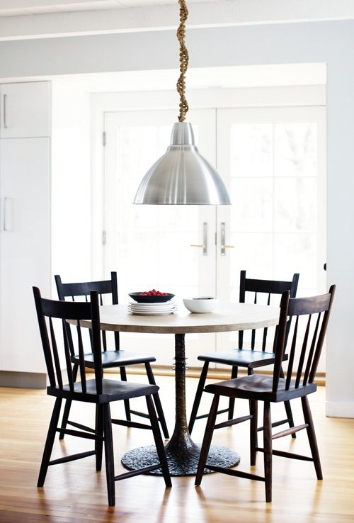
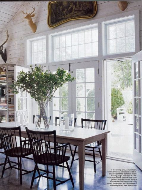
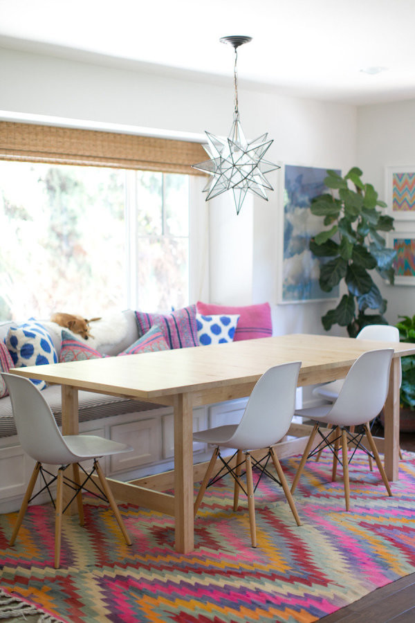
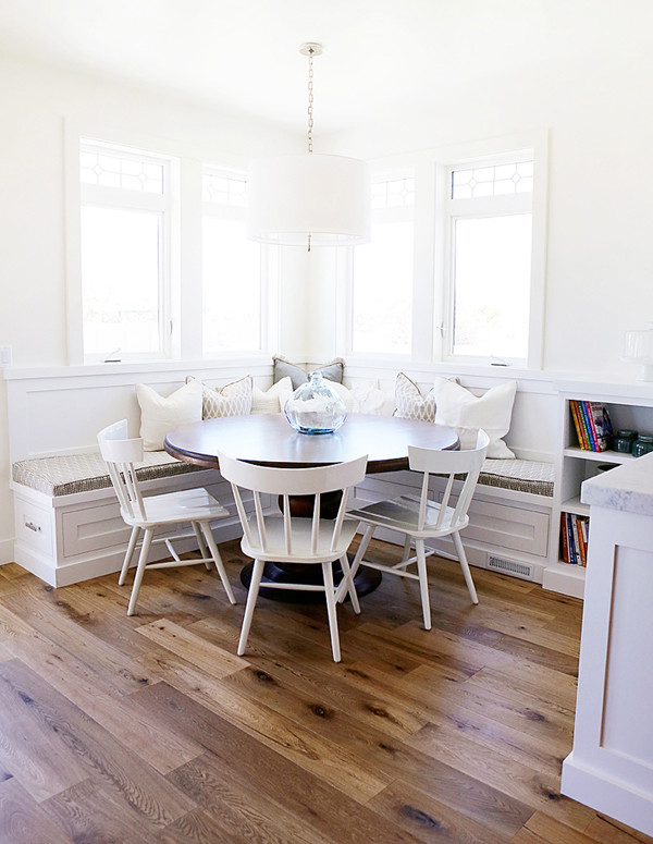
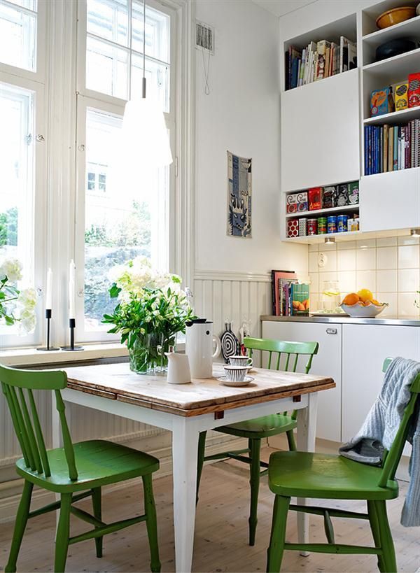
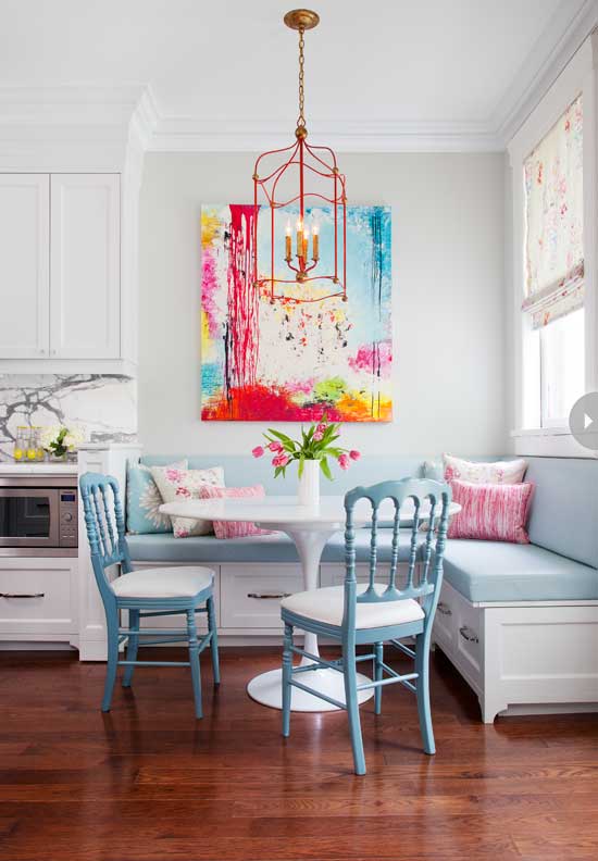
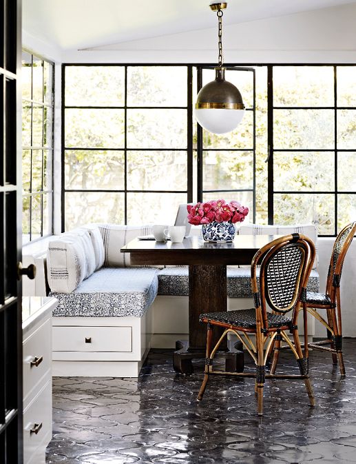
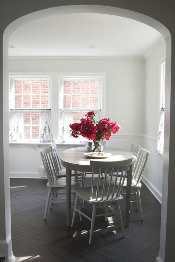
These thoughts and more looped through my mind for months, accompanied by some of this inspiration:


From top to bottom: Design Sponge, i suwannee, Style Me Pretty, Alice Lane Home, Scandinavian Apartment Ideas, Style at Home, La Dolce Vita, Design Sponge
When I just couldn’t seem to come to a decision after months of deliberating, I finally sent pretty much all of the above in a big messy email to my sister-in-law, pleading for help. Even just the act of writing down all of my options was helpful, and once I had her opinion, too, I felt ready to make a decision: we were going with white Windsor chairs. I did consider a few Wayfair options, many that were 50% of the price of our final decision, but in the end the reviews made me a bit nervous, as I want these chairs to last for a long, long time.
So, what did we decide on? We went with the Willa chairs in white from Crate & Barrel. I snagged them at 20% off during a dining sale (yippee!), and bought them in two installments to soften the budget blow a bit. I also had them shipped to the store, so there was no shipping cost.

We have been super happy with them so far! I think they play nicely with our antique table, and they definitely brighten the space. I also like that the set is a neutral base so that seasonal decor can be layered on top. We’re still considering adding upholstered chairs to the ends (maybe these?), but for now, I’m calling it a day.
…except, of course, that now I have my sights on a bed for our master bedroom. I currently have about 20 different styles and options pinned. Maybe you’ll hear from me in two years :)
Anyone else in my same boat with home decisions?? What do you think of this one?
14 October 2015
Even though I recently shared our home tour for this year (upstairs + downstairs), I already have an update! Knowing that our house photos with Anna were around the bend, I finally bit the bullet and framed two special pieces of art… but they arrived the day after our photos were taken!! I still wanted to share them with you, because I love them, and hopefully this story will also serve as encouragement!
Though we’ve made some progress since moving in with getting things on the walls, there were still two pieces that remained tucked away. They were both non-standard sizes, which meant I couldn’t just go out and buy a frame at Target or Michael’s. I knew custom framing was in my future if I was ever going to display them properly, but having gone that route before, I was already cringing at the expense. A few months ago, though, my ears perked up when I started to hear about a few online custom framing companies, including Framed & Matted and Framebridge. I looked into them both, and ended up going with Framed & Matted – I thought their frame options were prettier, and their prices slightly more reasonable. Want to see what I ended up with?
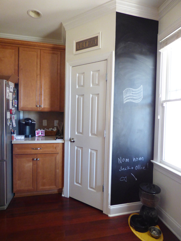
First, I framed a “You are my sunshine” print from (the now-defunct) Yeehaw Studios. For this one, I chose the Landon frame and a white mat. It took me six years to frame this little gem (!!!), but it was worth it – I love seeing it in our kitchen every day! This one was $67, including shipping.

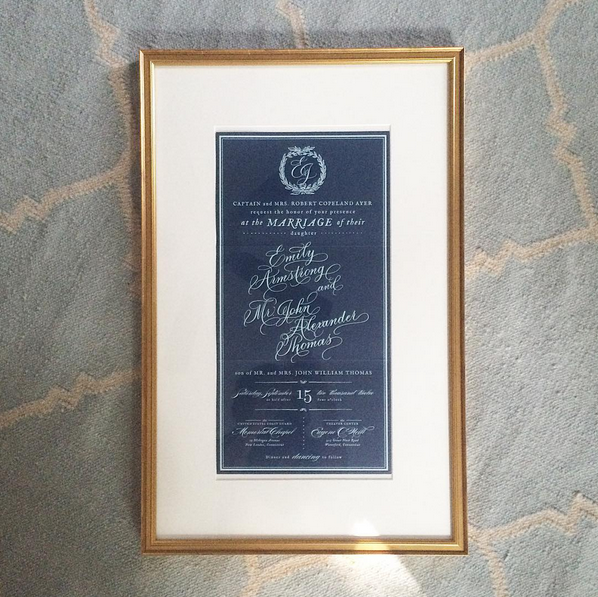
Second, I framed our wedding invitation! Y’all, I can’t tell you HOW HAPPY it makes me to have this project completed. From the minute I laid eyes on our beauty, I knew I wanted it hanging on the walls of our home. I’m still in awe of the work Magpie Paper Works and MM Ink did to bring it to life, and I love having this reminder of our wedding in front of me every day. For this one, we chose the Blair frame in gold, also with a white mat, and it was about $100. The invite is now hanging in our living room gallery wall, but the glare made it impossible to take a good photo – so here’s a detail shot!

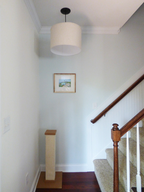
Yay!! Lots of happy developments with our walls lately, from these two new pieces to the travel quartet I talked about in our tour. I think they’ve emboldened me, as I now have big plans to add art to our downstairs hallway, our upstairs hallway, and the loft. I’m thinking my November goals will be heavy on art projects, as baby girl’s due date ticks ever closer!
8 October 2015
Nursery plans! Out of the blue, my buddy Lisa asked me several months ago if I had ever thought about what I would want a future nursery to look like (we take lots of long car rides together and have time to talk about everything). I was a bit taken aback, as, unbeknownst to her, I was already pregnant! The answer I gave her was “not really,” and I wasn’t just trying to avoid the topic – it was true! Though I had collected some inspiration over the years, a nursery wasn’t something I ever had a set vision for.
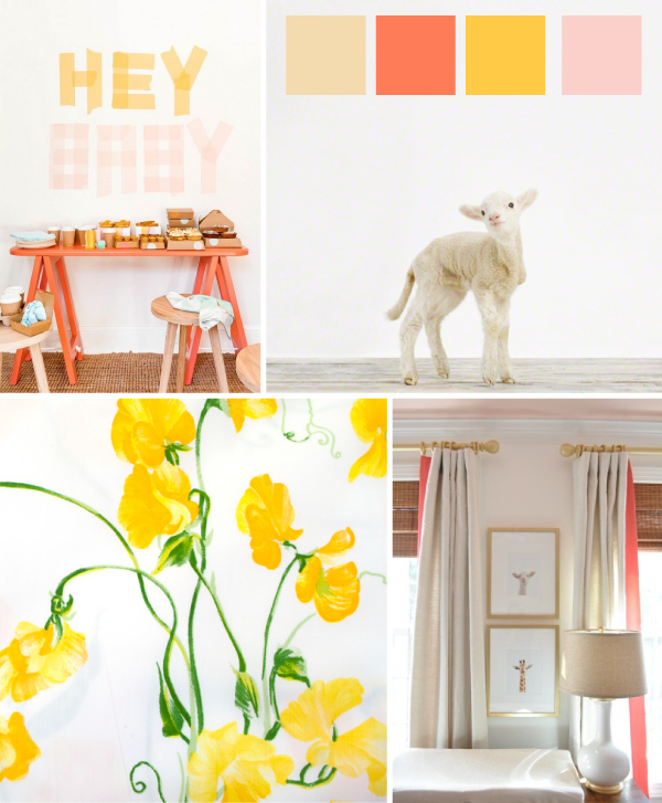
Things stayed that way into the first several months of my pregnancy — I saw things I liked, and even designed the following board which used some of my favorite colors, but nothing ever felt quite right.

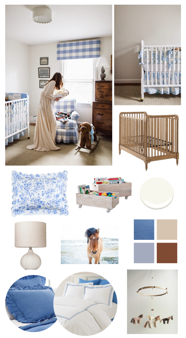
Then I stumbled across this nursery, and instantly fell in love. We didn’t know yet whether we were having a girl or boy, but I knew I could make it work either way.

Jessie gets the lion’s share of credit for my inspiration above — we will be using the same buffalo check fabric, the same light fixture, and similar crib bedding as she did. However, since our room is for a little lady, we’ll be adding a few horse accents — I was completely horse crazy when I was younger, and my Dad grew up on what is now a horse farm. (Actually the oldest continuously working farm in Connecticut! I love having that heritage as a part of her space.) I also think the toile and floral patterns make the overall look a bit more feminine in our rendition.
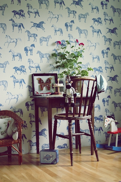
I seriously considered wallpapering one wall once I stumbled across the adorable Collette pattern from Sandberg Wallpaper, but alas they have discontinued the blue colorway:

from this blog
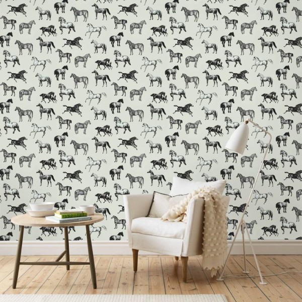
They still carry a lovely black colorway, but it’s not right for this room:

After total inaction for the first six months of pregnancy, the last week or so has been a whirl of progress! My Dad painted the walls (Benjamin Moore Simply White), we’ve assembled the crib (the same Jenny Lind beauty my sisters and I used as babies, unearthed from my parents’ attic!), and we’ve purchased a light fixture, a blue toile crib skirt, and a lamp. Next on the list? Switching out the light fixture, choosing a glider, deciding on window treatments (should we do drapes or a pelmet box like this?), ordering bedding for the twin bed that will also be in the room, and deciding on artwork. I am hoping to scrounge up some vintage photos of my family’s farm and horses; I also love the print from Minted in my inspiration above.
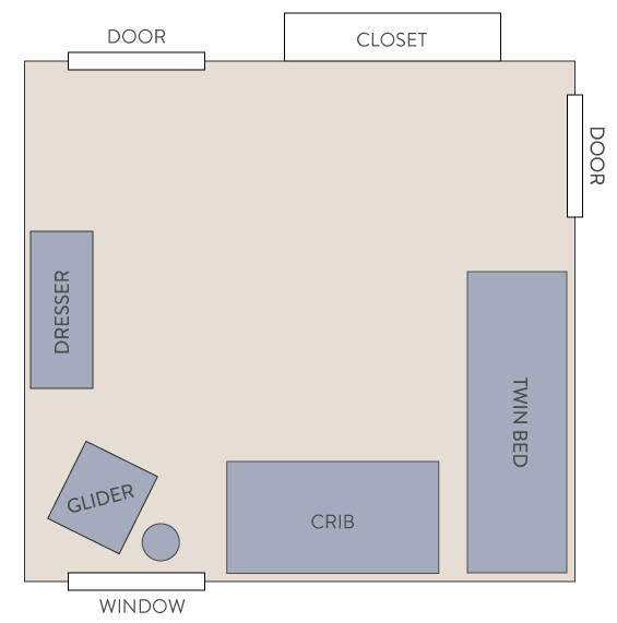
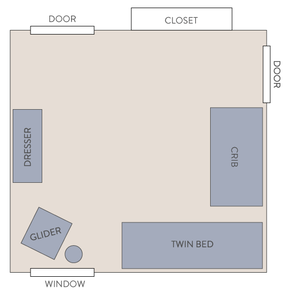
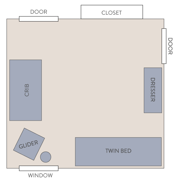
I’d also like to settle on a room layout. Here are the three options we’re considering:

Option 1: Not sure if having the crib and bed that close together is ideal, even though no one will be sleeping in the twin most of the time.

Option 2: Same issue with the bed and crib, though there might be a little more wiggle room.

Option 3: This layout allows more room between the beds, but I don’t know if having the crib so close to the door is a good idea?
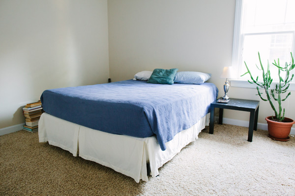
Just as a note, the door on the right-hand side is a little mini door to our attic storage. And as a reminder, here is the room “before:”

I think that’s about all I have to report for now! I’d love your thoughts and feedback, including on my current decisions, if you’d like:
— Drapes or a pelmet box in blue buffalo check for the window?
— Room layout 1, 2, or 3?
Thanks, friends!!
6 October 2015
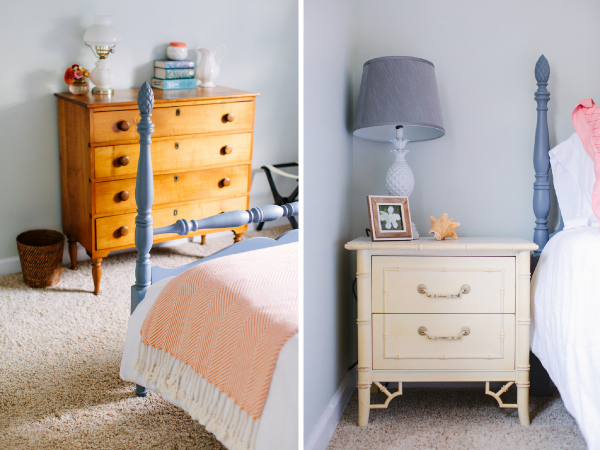
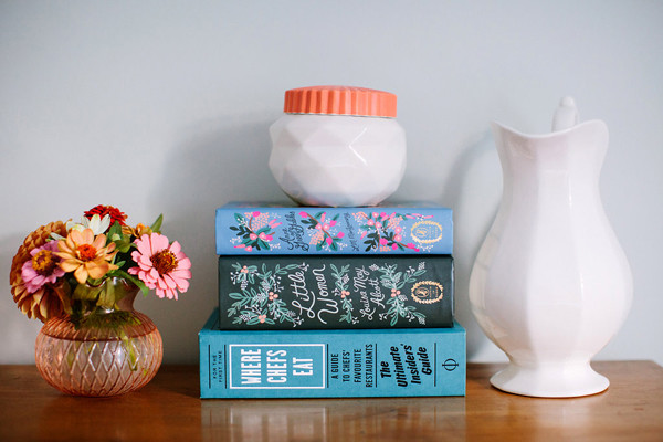
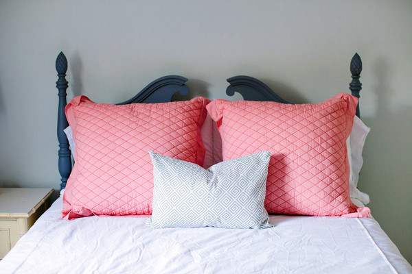
Welcome back, y’all! You’ve had a peek at our first floor, so let’s head up the stairs to the second. It’s still less-finished than our first, but it’s definitely coming along!


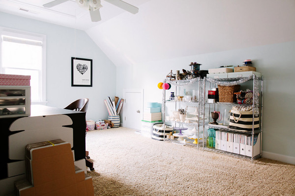
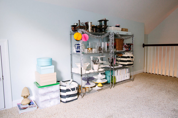
Things look pretty much the same in our loft. I do have big DIY plans for art for the wall over my desk — hoping I can get it done before the new year!!


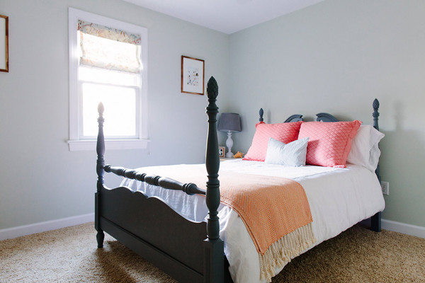
Speaking of art, I’d also love to add a piece of some sort over the guest bed. I’m not sure yet what would fit best with the still life photos we already have, but I’m thinking maybe a landscape painting.
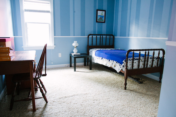
Alright, here we are at our last two photos of this year’s tour! They might be the least interesting, but to me they represent the greatest amount of potential. In fact, they’ve already changed quite a bit since these photos were taken! For one, the beds have been swapped, so that the queen bed is now in the blue striped room and the twin bed is in the “cactus room” (which will be baby girl’s room). As of this weekend, baby girl’s room has also been painted, her crib assembled, and Mr. Cactus has been moved to a new home :)


I think my next blog post will be about our plans for the nursery, so you’ll get a better idea of where these rooms are headed! In the meantime, thank you all for your kind comments, and don’t hesitate to ask if you have any more questions about sources!
Once again, all photos except the first one are by the lovely Anna Routh, first shared in our home tour on Southern Weddings.

