30 September 2015
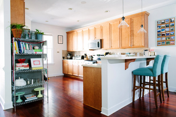
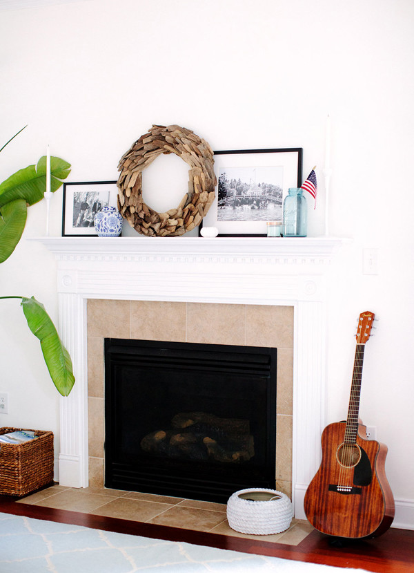
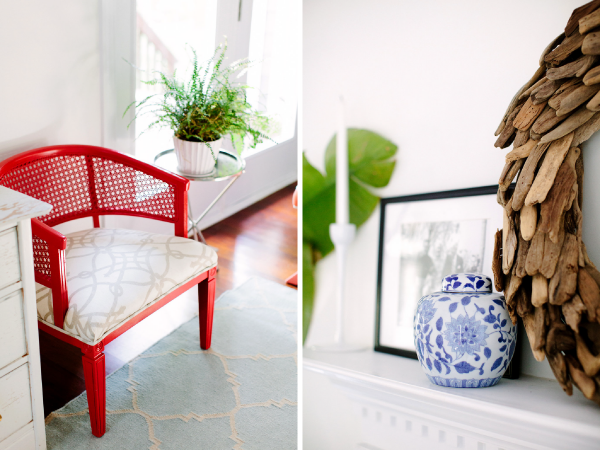
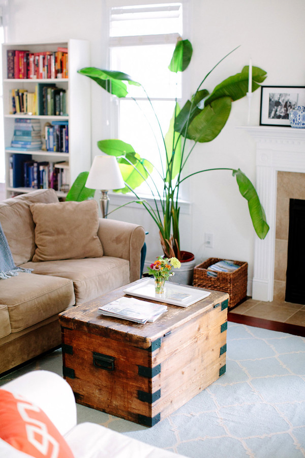
We’ve been in our home for about two and a half years now. Decorating progress, as ever, has been slow and steady. Sometimes slower than we would like, due to the budget and my tendency to overthink home purchasing decisions (there is NOTHING that I overthink more than home purchasing decisions). However, sharing these yearly-ish tours helps me see that there IS progress being made, that our home is inching closer and closer to the vision we have for it, and that we have much for which to be grateful. I hope you enjoy this peek into a home in progress!
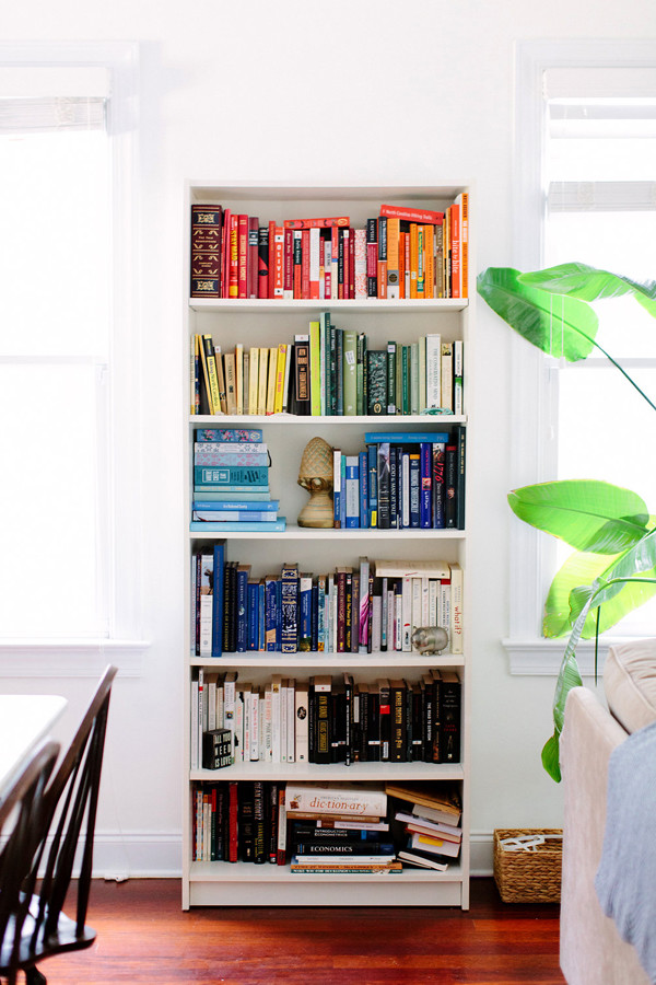
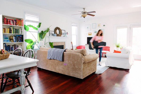
All photos are by the lovely Anna Routh, first shared in our home tour on Southern Weddings, except the obviously worse-quality ones, which were taken by me :)

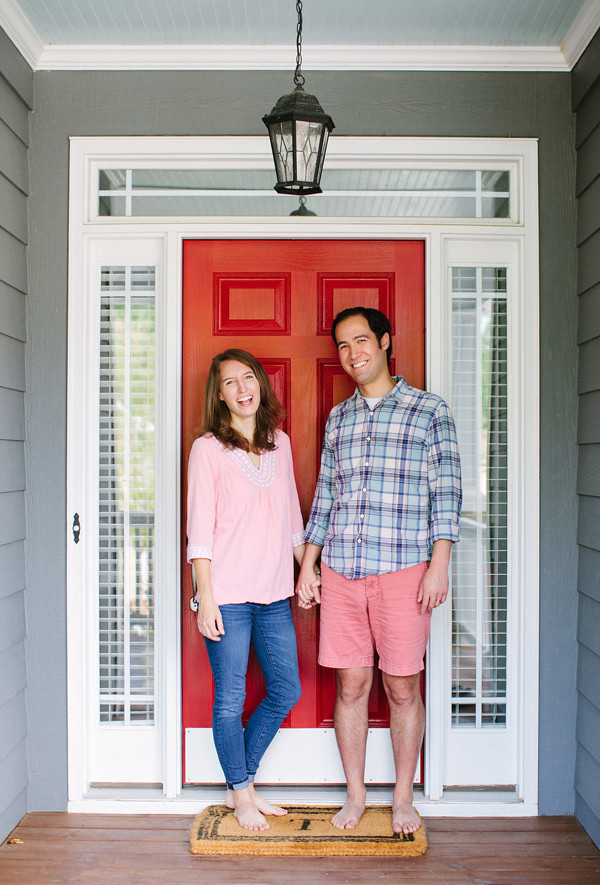
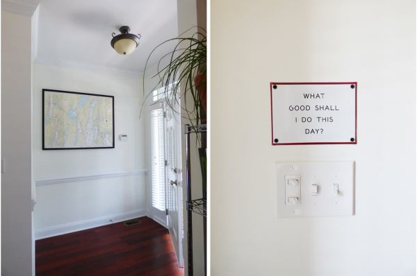
Here’s a good look at the true color of our red front door!


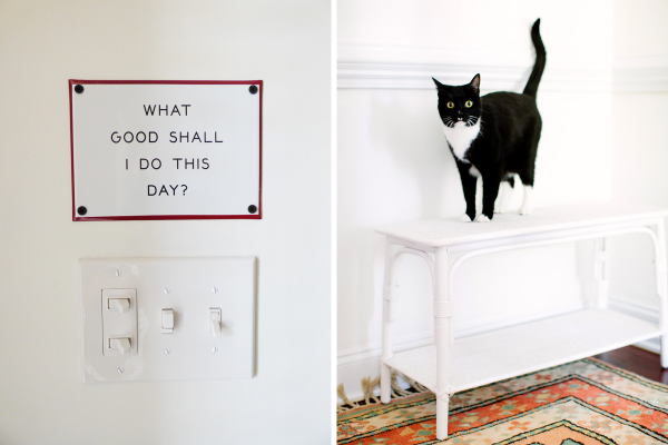
Jack always wants to do good :)

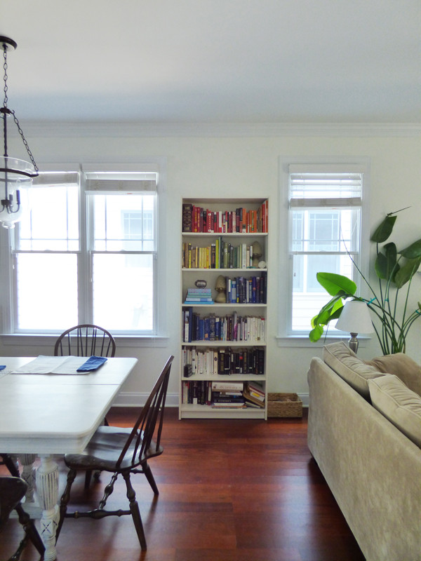
I am SO excited to say that since these photos were taken we’ve purchased new dining room chairs!! The ones here, the same ones we’ve had since starting out, were free hand-me-downs, and though they’ve served us well, I didn’t love their color, they had some glitter and fluff stuck to them from their previous owners, and there were only four of them. It took me so long to figure out what we wanted, but I’m happy to report I’m very pleased with our decision. Will share more soon!


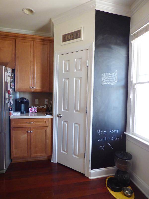
Our plan for replacing paper towels is still going strong!


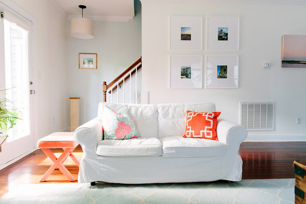
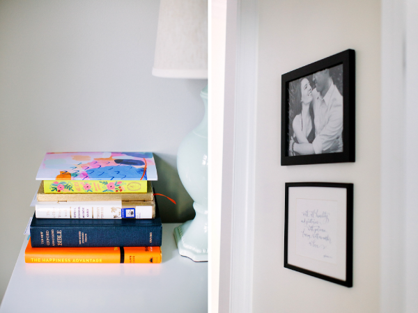
I shared my plan for re-working our big wall of art last year, and here’s the final result! The four photos are ones we took on our last four big vacations.


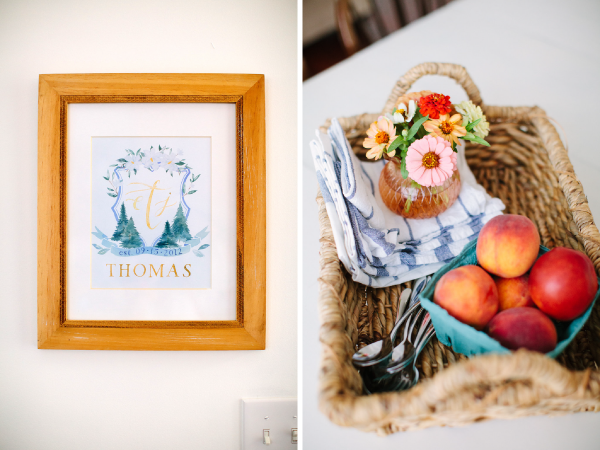
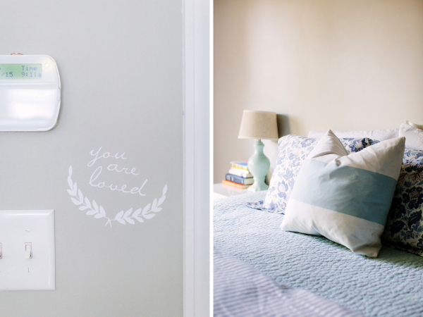
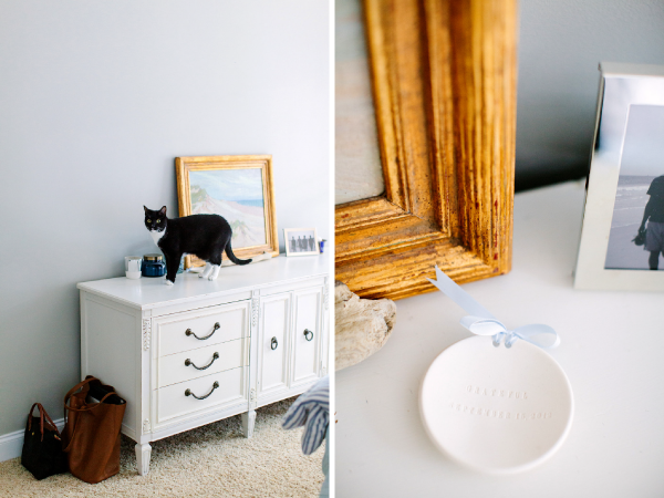
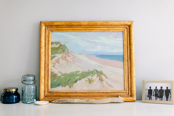
We didn’t get a great pulled-back shot of the master bedroom, but here are a few details!


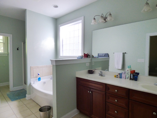
For more photos and more sourcing information, check out last year’s tour! You can also see a few “before” photos here. And if you have any questions about sources or paint colors that I haven’t already answered, just leave a comment — I’m more than happy to help.
Back with the upstairs soon!
14 July 2015
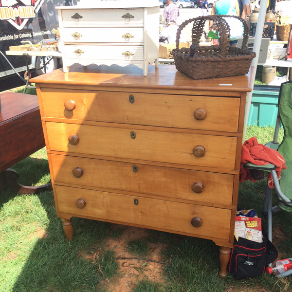
I found a gem at the flea market this weekend! I’d wandered almost every aisle (in 96 degree heat and full sun, might I add) before I saw it, and was feeling a bit discouraged because this was my third trip in a row without anything sparking my fancy. But as soon as I saw this beauty, my heart was hoping to take it home.

The price ($350) was more than I was prepared to spend, however. Happily, we were able to agree on $250 after a bit of negotiation and a quick consult via phone with John. It’s more than I’ve paid for other flea market furniture, but I feel good about it. The color of the wood is exactly what I’ve been looking for, and it’s in fantastic shape. If I was planning to paint the piece, I would have looked for something a little more banged up (and cheaper). It’s also solid wood, even the back, with no veneer.
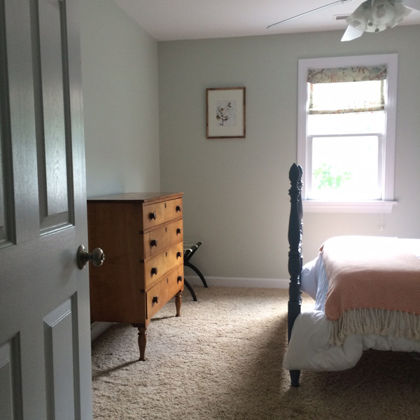
Right now we have it in our guest room, and I really like how it looks with the wood tones of our frames. I’m not sure that this room will be its forever home, but it’s perfect for now!

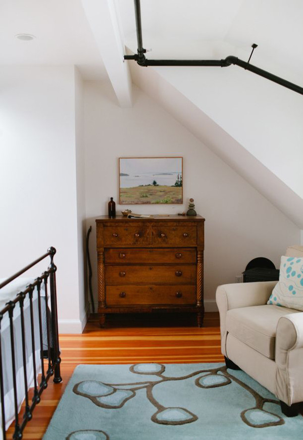
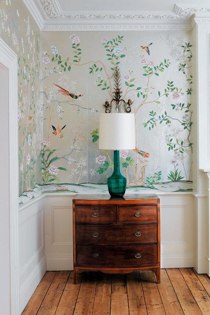
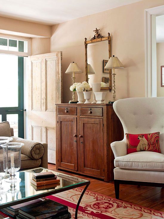
These were the two images that inspired me to look for a piece like this:


First credit is unknown, second photo is by Meredith Perdue from Nebo Lodge
Our home is being photographed for Southern Newlywed in a week, and I am feeling a little anxious. I’m trying to avoid a mad rush to do things just to do things, but instead only moving the timeline up a bit on improvements we’ve already decided on. I think the anxiety comes from people looking at our home and thinking a) that’s all you’ve done in two years?? or b) that’s boring and not inspiring. However, I keep reminding myself that we don’t make decisions based on what the internet thinks, but on what’s right for us. Our home might even look a little empty to some, but that’s not a good reason to spend money and rush to fill it with things we don’t need or want.
On the bright side, I love that SW includes a lengthy interview with the couple; there’s nothing I love more than filling out a good interview. Even if our photos don’t do it for some readers, perhaps there’s a nugget that will speak to them from our interview :)
18 February 2015
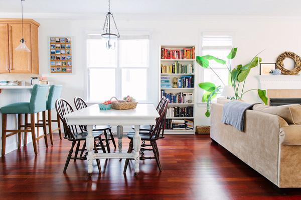
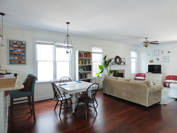
I say “dining room” lightly, because as you know, our downstairs is pretty much one big open space!

We are situated VERY close to our neighbors, so window treatments have to be functional as well as aesthetically pleasing. Our house came with nice blinds, and we usually keep them all the way down for privacy reasons. I don’t mind the look of them, but I would love to be able to keep them up to allow more light in! To do that, however, we need to add something into the mix – and that’s where cafe curtains come in. Though I don’t always love the look of them (they can look a little country), I think they are the perfect solution for this spot.

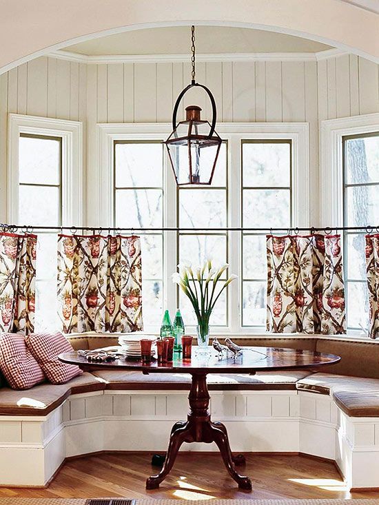
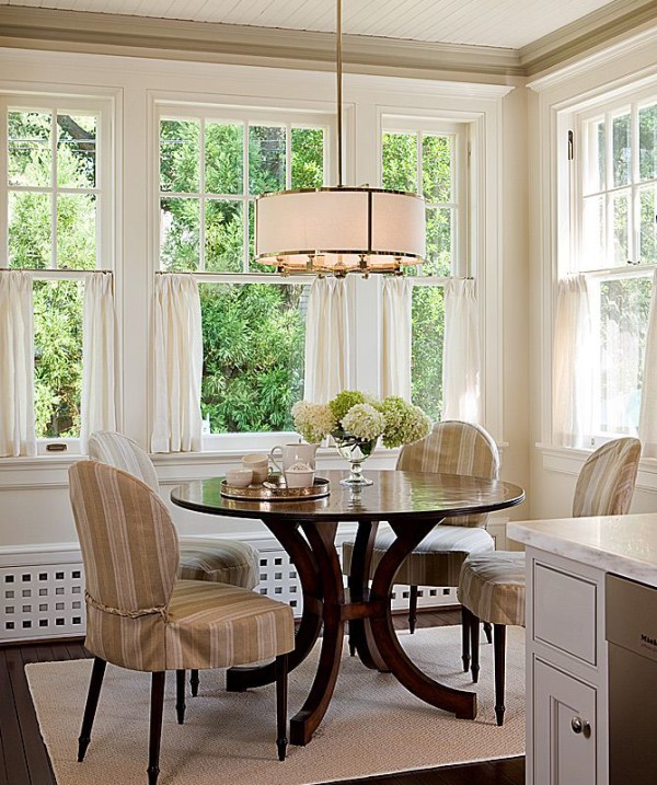
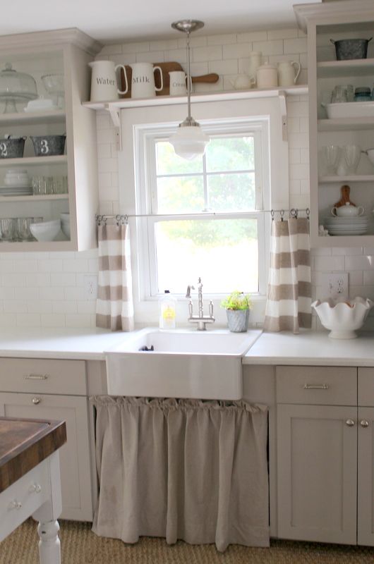
Cafe curtains would allow us to keep the blinds completely rolled up and let lots of sun in through the top half of the windows, but our neighbors would only be able to see the tops of our heads when the curtains were closed. Sounds good! Here are a few images that have been inspiring me…


Better Homes & Gardens, Anne Decker Architects, Proverbs 31 Girl, unknown
I also found this little video, which has some helpful hanging tips! I think the key to making this type of curtain look less country is to use rings instead of a rod-pocket or tab style.
Now, my decisions:
1. Inside mount or outside mount for the hardware? I think this one is made for me – with the way our windows are built, I think it has to be outside mount. I am eying this set, but I might be able to find something similar for less at Home Depot/Lowes.
2. Curtain color? I want something very light and airy, so there are pretty much two options with our house’s palette: white or pale blue. I am not feeling a pattern right next to the table, unless someone would like to try and convince me otherwise :)
The plan is to buy fabric and either use the no-sew iron-on adhesive technique I’ve used before, or ship the fabric to my sister and see if she’ll sew a few hems for me on her sewing machine!
Anyone have any experience with cafe curtains? Or privacy from close neighbors? :)
21 January 2015
Well, friends, Christmas has finally wrapped up in the Ayer family! Yes, you read that right. My whole family wasn’t able to gather in December due to work and school schedules, so we declared Martin Luther King, Jr. weekend our celebration. The older I get, the more I understand that it’s not so much about when you celebrate, but the people with whom you celebrate!
The highlight of our weekend, however — beating out opening presents, many rounds of Mexican Train, and chasing my 13-month-old niece — had to be the enormous bonfire we lit in my parents’ backyard. My Dad disassembled the playground he had built 25 years prior and that we had spent thousands of hours playing on, and we sent it off in style with 20+ foot tall flames. It was a sight to see. We even roasted marshmallows in the embers after it had been burning for 12 hours!

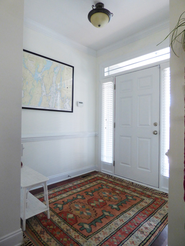
Thankfully no neighbors called the fire department. In other news, we are making progress on our foyer! You may remember it from our house tour, when it looked a little empty:

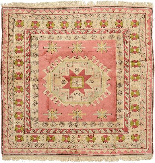
It was sporting our beloved nautical chart, but that was about it. Over time, we hope to add a multicolored vintage rug, replace the light fixture, and add some sort of storage or seating. Many moons ago I came across a particular beauty on esalerugs.com, and fell in love:

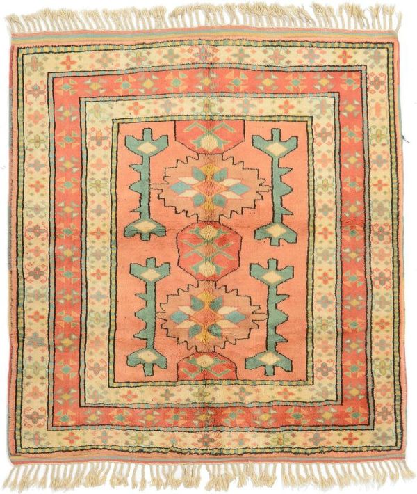
I would click over to it multiple times a week for several weeks, until the sad notice popped up that it was being shipped to a (lucky!) client. I continued to look over the options every so often, but never saw something I loved quite as much – until this one appeared!

From my time spent browsing the site, I knew it was the one, and at 50% off, it fit within our budget. I showed John, and miracle of miracles, he immediately agreed! He must have know it was the one, too :) Here’s a peek at it in our house!

It arrived within a few days, and we’ve been super happy with the quality so far! Highly recommended. (And tip: if you’re not buying it at 50% off on this site, you shouldn’t be buying it!)
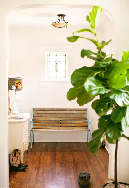
Now that we have the floor layer in place, I’ve moved on to the next! We’ve been debating whether to add a dresser…


Unknown, Seventh House on the Left, Better Homes & Gardens
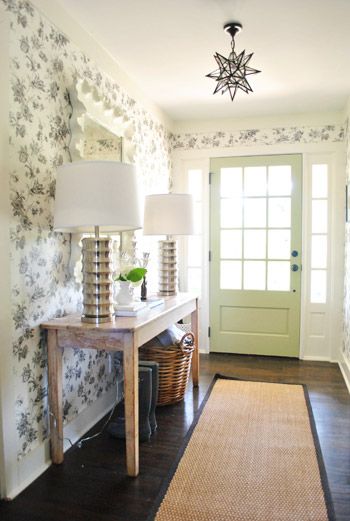
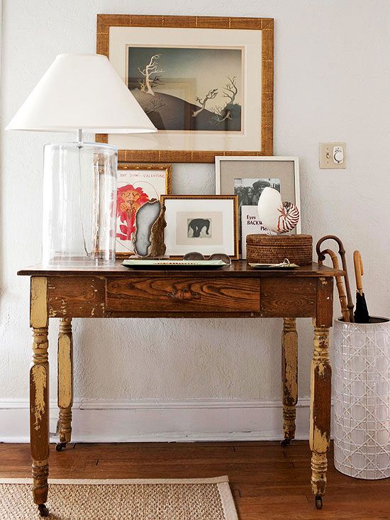
a console table…


Young House Love, BHG
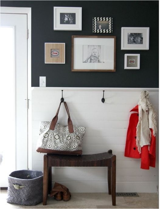
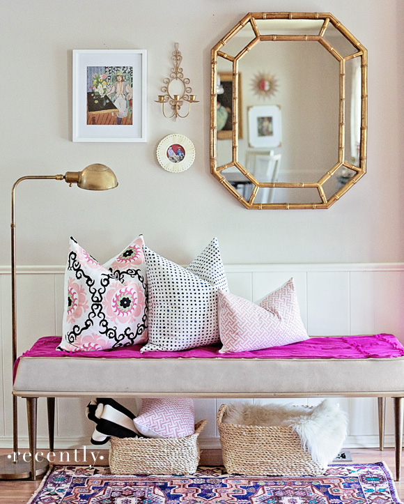
or a bench:


House Tweaking, Recently, Design*Sponge
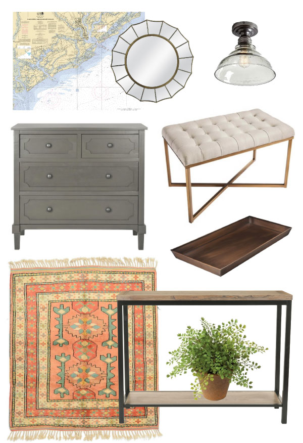
John is leading toward a bench, but I like the idea of having a surface. We’d likely combine either with hooks on the wall and a shoe tray. Here’s a bit of inspiration for either scenario!

Mirror, tufted bench, boot tray, console table, flushmount light, dresser
Which would you choose? Do you have one or the other set-up in your house, and do you like it?

