26 April 2011

It’s royal wedding week! I know some of you are probably sick of the festivities by now, but I am definitely not! How often do we get to celebrate a real prince and princess’s wedding?!
Here’s a board in love with all things royal, with a deep sapphire color palette inspired by Kate’s engagement ring (and engagement announcement outfit!), complete with plenty of gilded touches. I have my fingers crossed we’ll see a dainty golden circlet on Friday… how about you?
The Details:
First row, left to right: jewel-encrusted hair comb photo by Leo Patrone via Style Me Pretty, sapphire tablescape photo by MIMMO+NAZ (styled by Principal Planner) via Style Me Pretty
Second row: blue bridesmaids photo by A Bryan Photo, stationery suite by Mr. Boddington’s Studio
Third row: portrait by Leo Patrone via SMP, cake by Maples Wedding Cakes, tablescape detail photo by MIMMO+NAZ (styled by Principal Planner) via Style Me Pretty
28 March 2011

(Click to enlarge!)
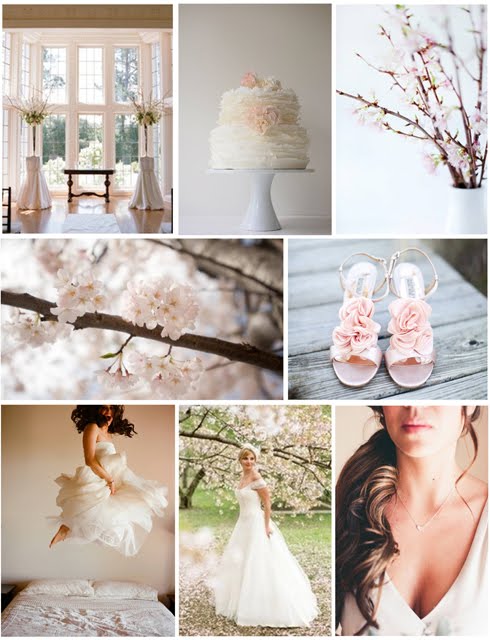
J and I are headed to DC this weekend to visit family, and I’m so excited to see the cherry blossoms! I went with the lightest, most delicate version of the blossoms for this board, and added in lots of delightful ruffly details. I think a White by Vera Wang dress would be perfect for this wedding!
The Details
First row, left to right: ceremony photo by Lisa Lefkowitz via Style Me Pretty, cake by Maggie Austin, flowering branches photo by Aran Goyoaga
Second row: cherry blossoms photo by Jennifer McMenamin via United With Love, ruffly shoe photo by Melissa Schollaert
Third row: portrait by Elizabeth Messina, cherry blossom portrait by Shelly Kroeger, teeny heart necklace photo by Beaux Arts Photographie via Style Me Pretty
I’ll be back with a few more cherry blossom wedding ideas tomorrow!
21 March 2011

(Click to enlarge!)
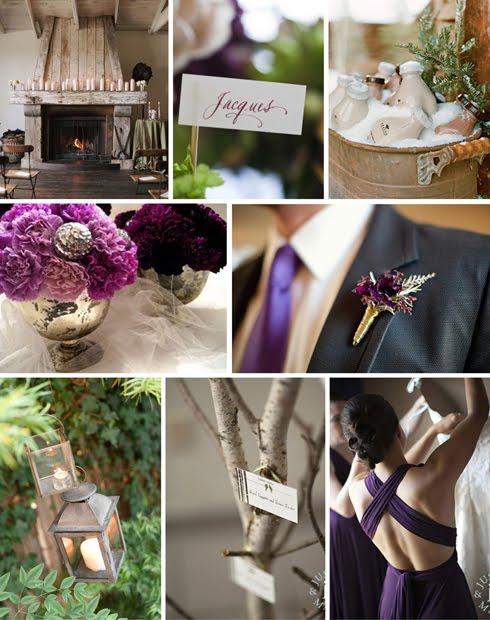
My good friend Caroline is getting married next January in Massachusetts. I’m so excited she’s having a winter wedding! I think they’re beautiful, but quite rare. I’m also excited about her color palette, but I’ll let her tell you a bit more about that. Here are the guidelines she gave me when she asked me to put together an inspiration board:
“Colors: some combination of a deep green, plum or violet, silver, and ivory/white. I like the idea of my two bridesmaids in a shade of silver with more colorful bouquets, but I’m also wary of a silver color washing them out…what do you think? I’d also like to keep a winter-y, natural and organic feel but without doing a literal interpretation of a snow-covered evergreen forest…”
Doesn’t that sound beautiful? In addition to shades of evergreen and plum, I love the idea of incorporating wood elements to bring in the natural and organic feel Caroline is looking for — escort cards tacked to a stack of cut wood, silvery birch elements either in centerpieces or framing the ceremony space, pinecones tucked into bouquets or used as boutonnieres, tree stump rounds standing in for cake plates.
I think gray bridesmaid dresses are beautiful, though personally I would steer clear of a metallic silver because I think Caroline’s right, it might wash out the girls. Plum, as pictured in this board, is another gorgeous option.
Other things I love about this board? The centerpieces of massed carnations in faux mercury glass bowls, the weathered lanterns (which would also be beautiful as centerpieces!), and the ceremony space, with all that weathered wood and those cream pillar candles.
Caroline, I hope this has been helpful! Ladies and gents, if you like this post, you might want to check out the Pinterest board where I’ve been collecting ideas. There’s a gorgeous bouquet, a beautiful winter portrait, and a pair of perfectly purple velvet heels, to start.
The Details:
First row, left to right: ceremony photo by Thayer Allyson Gowdy via Snippet & Ink, photo by Carla Ten Eyck via Elizabeth Anne Designs, rootbeer milk photo by Aaron Delesie via Martha Stewart Weddings
Second row: carnation centerpieces by Blush Floral Design, boutonniere photo by Anna Sawin via Style Me Pretty
Third row: lantern photo by Steve Steinhardt via Style Me Pretty, birch and plum bridesmaid dress photos by Justin & Mary Marantz
14 March 2011
On Tuesday’s post, Amanda asked how I put together inspiration boards. There are many, many tutorials out there, but I thought I’d share the process I use.
Inspiration boards can be useful for so many things, and they can be both very practical (pulling together interior design ideas for your living room, testing out color combinations for new website branding) and very whimsical (piecing together photos that inspire the kind of life you want to live). I love them all!
No matter what sort of board you want to make, the first step is pulling together inspiring images. If you’re making a board for your wedding, don’t feel limited by using only wedding images! Feel free to pull from interior design, food photography, etc. Just look for images that make you pause, images that you can’t let go of.
Since I make a wedding inspiration board (almost) every week, I need a lot of inspiring photos. I find that for me the most useful way to organize is by color, and for years I sorted images in folders named by color on my laptop. (Sidenote: Always save an image you love, even if you don’t have a use for it at the moment — you’ll kick yourself trying to find it later if you don’t!) I’d name the files with keywords designed to make searching for the credit to link to easier later on (i.e. “Janet and Mark on SW,” which would be from Janet and Mark’s wedding on Southern Weddings), which worked most of the time but was not perfect.
Now, however, I have a MUCH better system, and it’s called Pinterest! I still organize by color, but each image links directly to the source, so it’s SO easy to go back and credit an image later. I can’t recommend it highly enough.
For those of you who aren’t familiar with Pinterest, here’s what my home screen looks like:

As you can see, I have all different sorts of boards, from clothes that inspire me to party ideas to inspiration for my future farm :) I also have the color boards I pull from for wedding inspiration boards. Here’s a snippet of green:

And yellow:

So easy! So, once you have a few images you love, it’s time to start piecing them together. There are many, many ways to do this (Photoshop, InDesign, Illustrator, Polyvore, even Microsoft Word or Powerpoint), but the program I use is called Microsoft Publisher.
To make a board in Publisher, I open a normal 8.5×11 document and begin pasting in any photos I’m considering using. It might look like a little like this at this point:

Then it’s just trial and error — moving things on and off the board until everything is in roughly the right spot. After that, all that’s left is to sharpen everything — making sure that the space between photos is even, that the color balance is right, etc.

To finish, I export the board as a .jpg and then resize it for P&P in Publisher. And that’s that!

Tips for making your boards look a bit more “pro”:
— I know it can be tempting, but don’t try to cram 8,000 photos onto the board. An inspiration board is simply supposed to evoke a larger event, room, or idea, not detail it out. Simplicity will always look better.
— Likewise, try to keep all of the photos roughly the same size.
— Make the spaces between photos even — you can do this using white lines, but I usually eyeball it.
— If you’re posting a board on your blog or in another public space, always, always, always credit your sources. And no, “Google Images” and “via Style Me Pretty” are not acceptable credits. If you’re unfamiliar with how to credit a source online, check out this post.
If you have any questions at all, I’d be happy to answer them! You can see all 86 previous inspiration boards I’ve posted by clicking here.


