6 February 2012
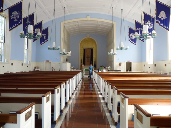
As you may recall, John and I are getting married at the Memorial Chapel at the U.S. Coast Guard Academy. It looks like this:

Ahhh, so beautiful.
Aside from being gorgeous, however, this lovely spot holds much significance for me. It’s on the base where my Dad went to school as a cadet, and where he worked as an active duty professor for more than twenty five years — from before I can remember to after I graduated from college. So many of my memories from growing up involve the Academy, from football games on Saturdays to sponsor cadets that became bonus big sisters, Easter egg hunts on the lower field, many windy Saturdays on the sidelines of the softball diamond eating extra box lunches (my Dad was the assistant coach), countless days spent in the auditorium amusing myself through my older sister’s musical rehearsals, trips to have lunch with Dad at the Officer’s Club (famous among my sisters and I for its “fancy bathroom”), and accompanying him to work when we stayed home from school (when he took us into the classroom with him, he would sometimes introduce us as the “visiting expert on Play-Doh” — a funny joke when you’re a Western Political Theory instructor).
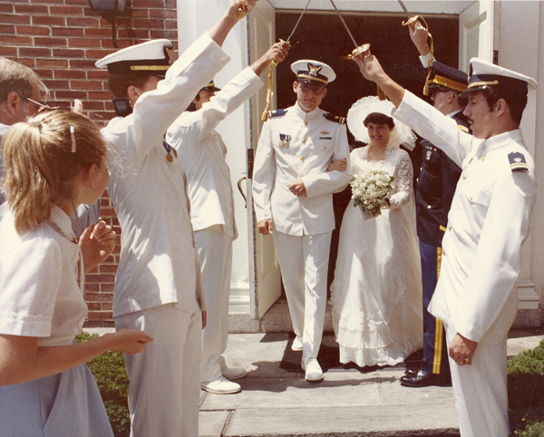
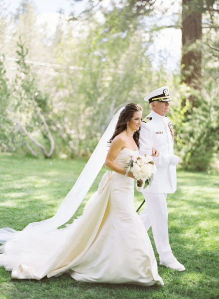
I also love that we’re holding our ceremony at the Academy because in a small way it’s a gesture of appreciation for all who serve in the military, including my Dad, several other family members, and one of my and John’s best friends from high school. I am so proud of my Dad’s service, and all those who serve, that I always knew I would want him to wear his uniform for my wedding. And wear it he shall! It won’t be the first time he’s worn it for a wedding, either:

Some of you may recall this gem from my parents’ anniversary, but I thought it was worth digging out again :)
My Dad and I are still discussing his sartorial choices, but we’re pretty sure he’s going to go all out and wear his service dress whites for the ceremony, then switch to his dinner dress blue uniform for the reception. I love it, and I can’t wait to walk down the aisle on his arm.
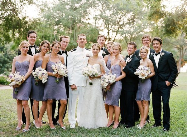
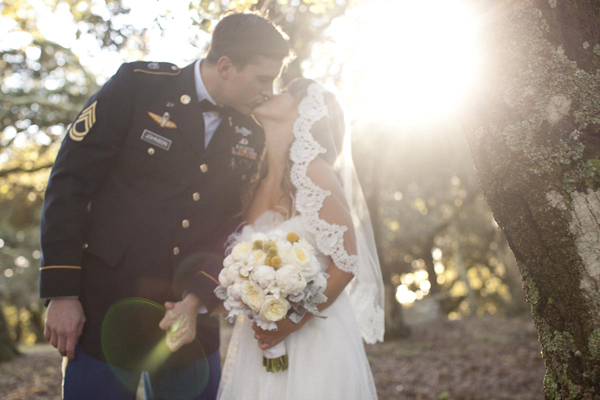
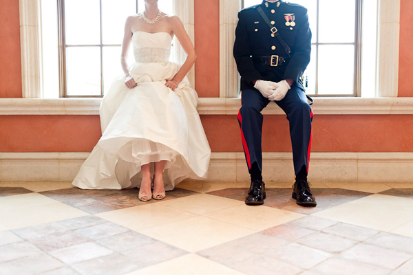
Just for fun, here are a few more service people at weddings.

Photo by Q Weddings via Style Me Pretty

Photo by Braedon Flynn via Southern Weddings

Photo by Erin Hearts Court

Photo by Jose Villa
What do you think? Ladies or gents who are getting married, does your ceremony spot hold special meaning? How about those of y’all who are already married?
3 February 2012
Happy Friday, friends! Fridays make me happy, and so does getting things in the mail, so what better day to post about our save the dates than today?
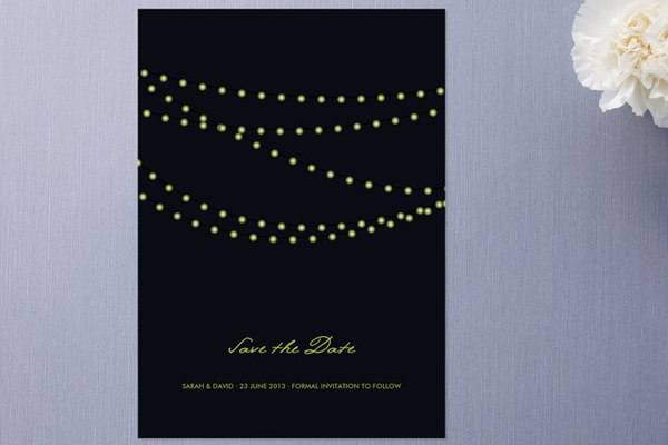
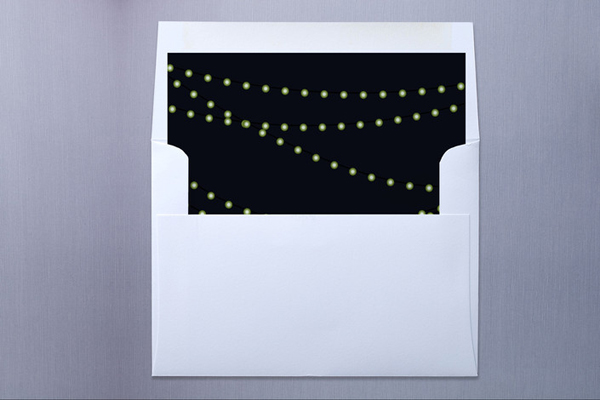
As you all know, we were choosing between a few different Minted designs. You overwhelmingly preferred the “Midnight Vineyard” style, and it turns out we did, too! We loved how the strings of light evoke an elegant evening garden party feel, which is exactly what we’re going for. However, as some of you also noted, the green ink was not the best choice for us. Here’s the original design again:

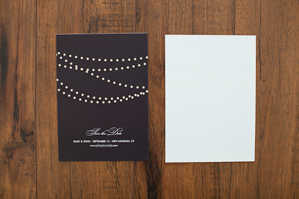
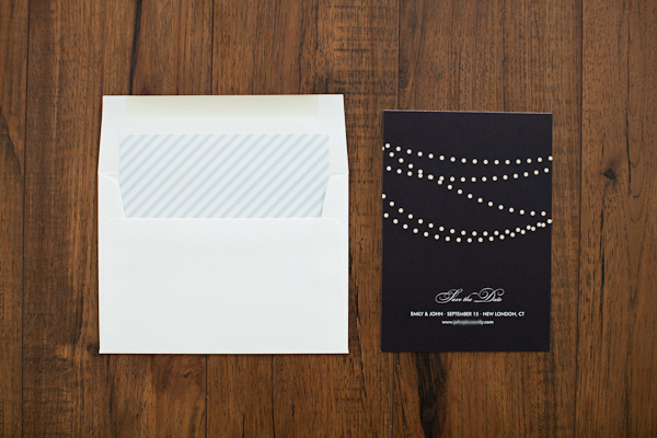
Thankfully, Minted is awesome about customizations, so we easily switched out the font (for something more classic), swapped the ink color (for a pale powder blue), and made a few text layout changes. We also opted for a solid-colored backer. It’s the same pale powder blue, though it’s kind of hard to tell in photos (and, truthfully, in person… should have made it a little darker!). Here’s the final design we ended up with!

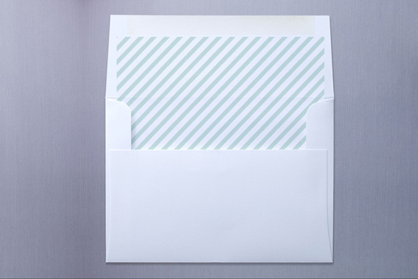
Pretty! We also wanted a patterned envelope liner. Midnight Vineyard has a standard liner design, which looks like this:

However, that was a little too matchy-matchy for me, so we opted to swap the standard liner for the liner that comes with the Kraft Ribbon Christmas card:

Voila!

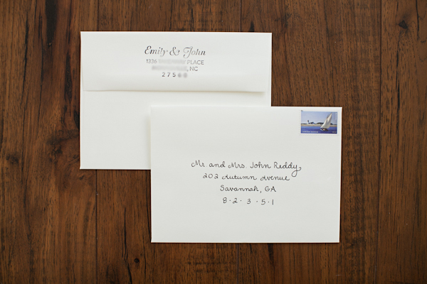
Now, to get these babies ready for their big adventure! I addressed each with my best handwriting, popped on my favorite stamps, and subbed in a custom rubber stamp from Rubberstamps.net for handwriting our return address on every envelope. For those who are interested, we ordered the 3 inches by 1.5 inches size, and I uploaded a custom design I made in Illustrator. I purposefully opted to leave our last names off, because this way, we can use this stamp even after we’re married! A very good $16 investment if I do say so myself.

Thank you very much to my friend Nancy Ray for taking these photos!
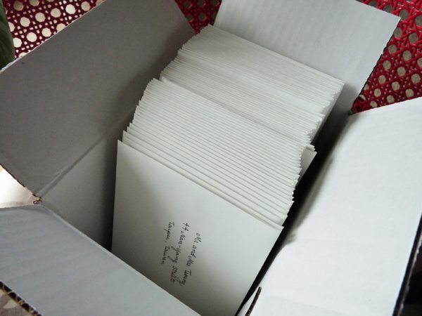
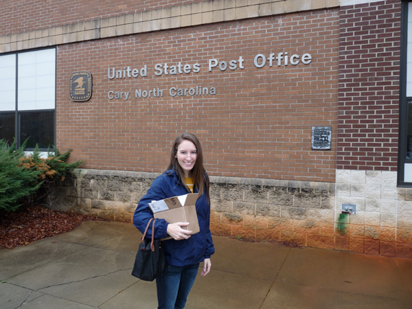
With everything addressed and stamped, all that was left was to box the pretties up and take them to the post office.

Which we did, on a very busy Saturday morning.

Yes, I am the ding dong that made my fiance take a photo of me in front of the post office.
Despite the line, I bravely asked the postmistress if I could hand cancel the stamps once we got to the front. She really didn’t want to let me, but eventually caved to my winning smile :) (Don’t worry, we stepped to the side while we worked so as not to hold up the line!) Why did I care about hand canceling? It avoids your mail being run through the machine, which imparts not-so-lovely neon markings and often mashes them up a bit, too. When you hand cancel, you just get a charming, old school stamp on the front. Tip for others who would like to hand cancel: make sure you stamp OVER your postage stamp (that’s what you’re canceling, get it?). Otherwise, your envelopes will be run through the machine anyway, and you’ll incur the wrath of the USPS to boot.
I’m so happy with how everything turned out! I did feel a good bit of anxiety as I worked on these, though, and I couldn’t understand why. Finally I concluded that it’s because sending out save the dates makes your guest list very real. These people are invited, and these people are not. We ended up cutting down our initial guest list a few months back once budget realities started to sink in, and of course, we had to leave people off the list that we would have loved to invite. There’s understandably a degree of sadness that comes with that. However, I’m so excited to celebrate with those we are able to invite, and hope they’ll all be able to make the trip to Connecticut in September!!
1 February 2012
It’s been a few months since my last 101 post, so I figured we were all due for an update and check in! Close observers of my original list will notice that I’ve modified a few goals since January 1, 2011. Some purists might consider that “cheating,” but to me, the point of a 101 in 1001 project is not slogging through a set of outdated goals that are no longer relevant or meaningful, but pushing and challenging yourself to live a better, more full life everyday.
With that, here are my goals for February:
— Finish the biography of John Adams I’m reading (for no. 61)
— Print out a favorite poem and commit to reading it every night as I brush my teeth (for no. 56)
— Design and print Em for Marvelous return address labels for Etsy store (for no. 76)
— Order my Warby Parker glasses now that I’ve returned my try on pairs (for no. 95)

Theurel & Thomas branding via Black*Eiffel (photos from Anagrama)
I also wanted to give you a quick update on my 2012 goal of establishing certain daily habits. (Here’s the original post if you missed it!) In a word, it’s going fantastic! I ended up ordering the goal log, and it’s been so helpful in keeping me on point.
If you’ve posted about February goals, feel free to leave a comment below — I’d love to come take a peek!

