19 September 2009

Remember when I fell in love with this upholstered headboard? {If you don’t, click here.} Well, I’m still in love, which is why I was instantly enamored with the recent DIY Grace posted on Design*Sponge.

She’s posted the full DIY, and it seems easy enough. Too easy in fact – it’s all I can do to stop myself from running to Home Depot to pick up some plywood and a staple gun tonight. Since I can’t exactly hang a flush mount in an apartment, alas, this project will have to wait.
19 September 2009
On my recent trip to the Raleigh Flea Market I only bought two things and spent less than $5. I love the experience of flea markets and love that you can come away feeling like you’ve found a treasure without spending a ton of money. If you don’t mind digging and haggling, it can be a very satisfying experience.
My finds this time around:

a rusty metal… thing ($1)

and an Aqua Ball mason jar ($4).
If you haven’t noticed yet, I like to collect things. Here are some other finds I’ve scavenged over the years from flea markets or from relatives:

an ironstone wash basin and pitcher…

a folding luggage rack with brocade straps…

and a Jasperware pitcher and milk glass vase.
I’ll share more soon if you’re interested.
18 September 2009


The Raleigh Flea Market was one of the best I’ve ever been to. It was mostly outside (and so smelled delightfully fresh, not musty and stale like some indoor markets); huge but not so overwhemingly huge that it was paralyzing; and had a great mix of cheaper knick-knacks, fine antiques, impressive crafts, and delicious looking produce. My favorite stall was the crazy wagon of rusted old metal {top few photos}.
Check back soon to see what I came home with!
17 September 2009
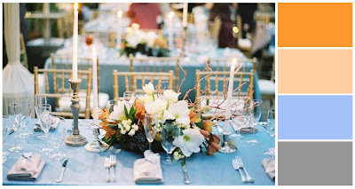
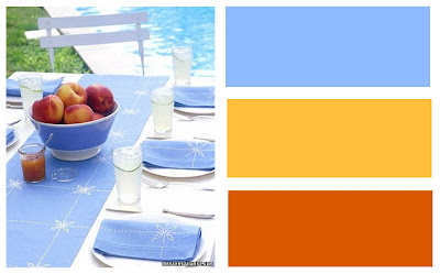
Good morning, y’all! Catherine is one of the recently engaged ladies I’ve been working with over the last few months. She’s planning a clean, warm, modern fall wedding with a blue and orange palette. Blue + orange can be a difficult combo to work with, because it can easily skew way too bright and garish. I wanted to try to pin down the exact combo she was picturing in her head before we moved forward with making a full-on inspiration board. Here are the options I sent her:
Palette No. 1

Palette No. 2

Palette No. 3
Palette No. 4

Palette No. 5

Palette No. 6
I’m eager to hear Catherine’s thoughts, but in the meantime, which palette would you pick?